[vc_row row_type="row" use_row_as_full_screen_section="no" type="grid" text_align="left" background_image="350246" box_shadow_on_row="no" el_class="y3insidebanner"][vc_column css=".vc_custom_1463731956110{margin-top: 30px !important;}"][vc_empty_space height="100" image_repeat="no-repeat"][vc_column_text] MUSEUM LABEL Unfolding stories, inspiring ideas [/vc_column_text][vc_empty_space height="200" image_repeat="no-repeat"][/vc_column][/vc_row][vc_row row_type="row" use_row_as_full_screen_section="no" type="grid" text_align="left" box_shadow_on_row="no"][vc_column css=".vc_custom_1463731956110{margin-top: 30px !important;}"][vc_column_text][sb-view-breadcrumb][/vc_column_text][/vc_column][/vc_row][vc_row row_type="row" use_row_as_full_screen_section="no" type="grid" text_align="left" box_shadow_on_row="no"][vc_column][vc_empty_space image_repeat="no-repeat"][vc_column_text el_class="h1-title"] Bringing the Singapore Museums experience to life with a retail brand that extends the story and connects to our culture. [/vc_column_text][vc_empty_space height="32" image_repeat="no-repeat"][/vc_column][/vc_row][vc_row row_type="row" use_row_as_full_screen_section="no" type="grid" text_align="left" box_shadow_on_row="no"][vc_column width="1/4"][vc_separator type="normal" up_style="px" down_style="px"][/vc_column][vc_column width="1/4"][/vc_column][vc_column width="1/4"][/vc_column][vc_column width="1/4"][/vc_column][/vc_row][vc_row row_type="row" use_row_as_full_screen_section="no" type="grid" text_align="left" box_shadow_on_row="no"][vc_column width="1/4"][vc_empty_space height="12" image_repeat="no-repeat"][vc_single_image image="351213" img_size="full"][vc_empty_space height="12" image_repeat="no-repeat"][vc_column_text] Singapore Design Awards 2016 Communication: Branding (Gold) [/vc_column_text][/vc_column][vc_column width="1/4"][/vc_column][vc_column width="1/4"][/vc_column][vc_column width="1/4"][/vc_column][/vc_row][vc_row row_type="row" use_row_as_full_screen_section="no" type="grid" text_align="left" box_shadow_on_row="no"][vc_column][vc_empty_space image_repeat="no-repeat"][vc_single_image image="350238" img_size="full"][/vc_column][/vc_row][vc_row row_type="row" use_row_as_full_screen_section="no" type="grid" text_align="left" box_shadow_on_row="no"][vc_column width="1/2"][vc_empty_space image_repeat="no-repeat"][vc_column_text] The Challenge Museum Label is the retail brand for Singapore's museums, offering merchandise to appeal to both local and overseas visitors. The National Heritage Board wanted to extend its mandate and expand to off-site locations, prompting a review of its brand. The challenge was to understand the needs of the two main user groups and define what lies at the heart of Singapore and Asian heritage and identity for each, and to make it meaningful when taken in and out of the museum context. [/vc_column_text][vc_empty_space image_repeat="no-repeat"][vc_column_text] The Insight Through insights gathered in research, we learned that ‘memories’ formed an integral part of the museum and museum shop experience for both local and overseas visitors. This gave rise to a brand proposition centred on the idea of story-telling, providing rich inspiration for the creation of a new retail identity. This was anchored on a framing device that creates a context for the stories being told, linking directly to the museum experience. This was applied to a full range of brand graphics and a retail concept designed to bring heritage and memories to life. The challenge for implementation was to create a design framework that is identifiable and unifying, while allowing each museum to express its...
[vc_row row_type="row" use_row_as_full_screen_section="no" type="grid" text_align="left" background_image="350148" box_shadow_on_row="no" el_class="y3insidebanner"][vc_column css=".vc_custom_1463731956110{margin-top: 30px !important;}"][vc_empty_space height="100" image_repeat="no-repeat"][vc_column_text] LIBRARY@ORCHARD Design is for everyone [/vc_column_text][vc_empty_space height="200" image_repeat="no-repeat"][/vc_column][/vc_row][vc_row row_type="row" use_row_as_full_screen_section="no" type="grid" text_align="left" box_shadow_on_row="no"][vc_column css=".vc_custom_1463731956110{margin-top: 30px !important;}"][vc_column_text][sb-view-breadcrumb][/vc_column_text][/vc_column][/vc_row][vc_row row_type="row" use_row_as_full_screen_section="no" type="grid" text_align="left" box_shadow_on_row="no"][vc_column][vc_empty_space height="32" image_repeat="no-repeat"][vc_column_text el_class="h1-title"] Framing the library as a ‘wonderland’ that makes design accessible and inspiring for all. [/vc_column_text][vc_empty_space height="32" image_repeat="no-repeat"][/vc_column][/vc_row][vc_row row_type="row" use_row_as_full_screen_section="no" type="grid" text_align="left" box_shadow_on_row="no"][vc_column width="1/4"][vc_separator type="normal" up_style="px" down_style="px"][/vc_column][vc_column width="1/4"][/vc_column][vc_column width="1/4"][/vc_column][vc_column width="1/4"][/vc_column][/vc_row][vc_row row_type="row" use_row_as_full_screen_section="no" type="grid" text_align="left" box_shadow_on_row="no"][vc_column width="1/4"][vc_empty_space height="12" image_repeat="no-repeat"][vc_single_image image="351215" img_size="full"][vc_empty_space height="12" image_repeat="no-repeat"][vc_column_text] President's Design Award 2015 Design of the Year [/vc_column_text][/vc_column][vc_column width="1/4"][/vc_column][vc_column width="1/4"][/vc_column][vc_column width="1/4"][/vc_column][/vc_row][vc_row row_type="row" use_row_as_full_screen_section="no" type="grid" text_align="left" box_shadow_on_row="no"][vc_column][vc_empty_space image_repeat="no-repeat"][vc_single_image image="350141" img_size="full"][/vc_column][/vc_row][vc_row row_type="row" use_row_as_full_screen_section="no" type="grid" text_align="left" box_shadow_on_row="no"][vc_column width="1/2"][vc_empty_space image_repeat="no-repeat"][vc_column_text] The Challenge After a 7-year long closure, the team behind library@orchard sought to create a next-generation library that integrates new experiences for users. Re-creating the library as a new kind of space that has multiple roles and reflects the needs of today's media-astute users was challenging and required new thinking. Concieved as a creative space that aimed to make design accessible, it sought to reach beyond the creative community to engage the public in the possibilities of design at all levels.[/vc_column_text][/vc_column][vc_column width="1/2"][vc_empty_space image_repeat="no-repeat"][vc_single_image image="350142" img_size="full"][/vc_column][/vc_row][vc_row row_type="row" use_row_as_full_screen_section="no" type="grid" text_align="left" box_shadow_on_row="no"][vc_column][vc_empty_space image_repeat="no-repeat"][vc_single_image image="350144" img_size="full"][/vc_column][/vc_row][vc_row row_type="row" use_row_as_full_screen_section="no" type="grid" text_align="left" box_shadow_on_row="no"][vc_column width="1/2"][vc_empty_space image_repeat="no-repeat"][vc_single_image image="350143" img_size="full"][vc_empty_space image_repeat="no-repeat"][vc_single_image image="350146" img_size="full"][/vc_column][vc_column width="1/2"][vc_empty_space image_repeat="no-repeat"][vc_column_text] The Insight Design as a discipline is often not well understood and may be seen as the remit of only those in the creative industry. Engaging a larger community in design implies the need to make design more engaging, understandable and accessible. To express the brand’s imperative, DIA captured the its essence in the tagline ‘Design is for Everyone’, a theme that is central to the development of the brand. This was brought to life through the idea of a ‘Wonderland’ – which frames library@orchard as a ‘rabbit hole’, where surprises abound at every corner. Using a distinctive visual and verbal language,...
[vc_row row_type="row" use_row_as_full_screen_section="no" type="grid" text_align="left" background_image="350172" box_shadow_on_row="no" el_class="y3insidebanner"][vc_column css=".vc_custom_1463731956110{margin-top: 30px !important;}"][vc_empty_space height="100" image_repeat="no-repeat"][vc_column_text] BALITHAI Where Thairiffic meets Indolicious [/vc_column_text][vc_empty_space height="200" image_repeat="no-repeat"][/vc_column][/vc_row][vc_row row_type="row" use_row_as_full_screen_section="no" type="grid" text_align="left" box_shadow_on_row="no"][vc_column css=".vc_custom_1463731956110{margin-top: 30px !important;}"][vc_column_text][sb-view-breadcrumb][/vc_column_text][/vc_column][/vc_row][vc_row row_type="row" use_row_as_full_screen_section="no" type="grid" text_align="left" box_shadow_on_row="no"][vc_column width="5/6"][vc_empty_space height="32" image_repeat="no-repeat"][vc_column_text el_class="h1-title"] Finding the sweet spot in two distinct cultures and bringing it to life in a vibrant revived brand. [/vc_column_text][vc_empty_space height="32" image_repeat="no-repeat"][/vc_column][/vc_row][vc_row row_type="row" use_row_as_full_screen_section="no" type="grid" text_align="left" box_shadow_on_row="no"][vc_column width="1/4"][vc_separator type="normal" up_style="px" down_style="px"][/vc_column][vc_column width="1/4"][/vc_column][vc_column width="1/4"][/vc_column][vc_column width="1/4"][/vc_column][/vc_row][vc_row row_type="row" use_row_as_full_screen_section="no" type="grid" text_align="left" box_shadow_on_row="no"][vc_column width="1/4"][vc_empty_space height="12" image_repeat="no-repeat"][vc_single_image image="351216" img_size="full"][vc_empty_space height="12" image_repeat="no-repeat"][vc_column_text] Marketing Excellence Awards 2013 Excellence in Brand Strategy Certificate of Excellence [/vc_column_text][/vc_column][vc_column width="1/6"][/vc_column][/vc_row][vc_row row_type="row" use_row_as_full_screen_section="no" type="grid" text_align="left" box_shadow_on_row="no"][vc_column][vc_empty_space image_repeat="no-repeat"][vc_single_image image="350173" img_size="full"][/vc_column][/vc_row][vc_row row_type="row" use_row_as_full_screen_section="no" type="grid" text_align="left" box_shadow_on_row="no"][vc_column width="1/2"][vc_empty_space image_repeat="no-repeat"][vc_column_text] The Challenge The BaliThai brand has been serving diners since 1993, offering the best of Thai and Indonesian cuisines. However, the lack of clarity in its offer hampered its growth especially in a market fraught with choices. [/vc_column_text][vc_empty_space image_repeat="no-repeat"][vc_column_text] The Insight DIA created a new strategic roadmap and brand identity to differentiate BaliThai from its competition and to extend its customer base to attract new and younger consumers. The BaliThai brand essence is built around the idea of ‘Feast your senses’, which refers to a combination of tickling the five taste and physical senses of the two distinct cultures and cuisines. This was the foundation for a powerful new dining experience. The brand tagline: ‘Thairiffic meets Indolicious’ sums up the brand positioning. This in turn inspired a revitalised brand identity and range of applications designed to bring the vibrant Thai and Indonesian cultures to life in a vivid, immersive dining experience. [/vc_column_text][vc_empty_space image_repeat="no-repeat"][vc_column_text] The Impact The refreshed branding has helped BaliThai grow in popularity across Singapore and to successfully enter the China market, where it is gaining with plans to enter other regional markets in the coming years. [/vc_column_text][/vc_column][vc_column width="1/2"][vc_empty_space image_repeat="no-repeat"][vc_single_image image="350174" img_size="full"][vc_empty_space image_repeat="no-repeat"][vc_single_image image="350175" img_size="full"][/vc_column][/vc_row][vc_row row_type="row" use_row_as_full_screen_section="no" type="grid" text_align="left" box_shadow_on_row="no"][vc_column][vc_empty_space image_repeat="no-repeat"][vc_single_image image="350176" img_size="full"][/vc_column][/vc_row][vc_row row_type="row" use_row_as_full_screen_section="no" type="grid" text_align="left" box_shadow_on_row="no"][vc_column...
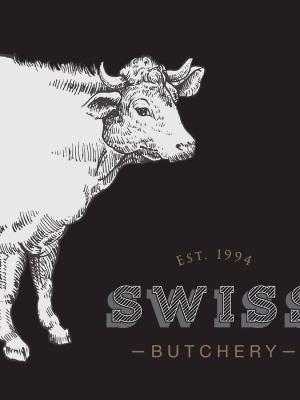
[vc_row row_type="row" use_row_as_full_screen_section="no" type="grid" text_align="left" background_image="350256" box_shadow_on_row="no" el_class="y3insidebanner"][vc_column css=".vc_custom_1463731956110{margin-top: 30px !important;}"][vc_empty_space height="100" image_repeat="no-repeat"][vc_column_text] SWISS BUTCHERY A cut above [/vc_column_text][vc_empty_space height="200" image_repeat="no-repeat"][/vc_column][/vc_row][vc_row row_type="row" use_row_as_full_screen_section="no" type="grid" text_align="left" box_shadow_on_row="no"][vc_column css=".vc_custom_1463731956110{margin-top: 30px !important;}"][vc_column_text][sb-view-breadcrumb][/vc_column_text][/vc_column][/vc_row][vc_row row_type="row" use_row_as_full_screen_section="no" type="grid" text_align="left" box_shadow_on_row="no"][vc_column width="5/6"][vc_empty_space image_repeat="no-repeat"][vc_column_text el_class="h1-title"] Recasting an age-old craft in a new light of finesse and quality. [/vc_column_text][/vc_column][vc_column width="1/6"][/vc_column][/vc_row][vc_row row_type="row" use_row_as_full_screen_section="no" type="grid" text_align="left" box_shadow_on_row="no"][vc_column width="1/2"][vc_empty_space image_repeat="no-repeat"][vc_column_text] The Challenge Swiss Butchery has been one of the pioneering premium butchers in Singapore since its opening in 1994 and has built a reputation for the freshness and variety of gourmet delicacies it brings in from around the world. But competition intensified over the years amidst rising consumer demand and new competition in the market. In light of this, Swiss Butchery found it critical to take stock and examine its brand and business. [/vc_column_text][vc_empty_space image_repeat="no-repeat"][vc_column_text] The Insight In-depth consumer research revealed that customers really cherish their ability to rely on Swiss Butchery’s team of experienced, passionate and familiar butchers for exciting ideas on how to share the flavours and stories of fine food with their friends and loved ones. DIA captured this in the brand essence ‘Inspiring relationships’ which has since catalysed a whole new way of telling the Swiss Butchery brand story, one that evokes its heritage and over 20 years of relationships forged through thoughtful advice and shared recipes. This was matched with a strategy to reinforce its position at the top of the market as expressed in the tagline 'A cut above'. The brand identity was entirely re-cast in a monochromatic design that is classic, with contemporary touches that lend a touch of timelessness and solid dependability. The addition of fine textures and other details also gave the brand greater depth and a level of authenticity appropriate to the craft of butchery and premium cuisine[/vc_column_text][/vc_column][vc_column width="1/2"][vc_empty_space image_repeat="no-repeat"][vc_single_image image="350271" img_size="full"][/vc_column][/vc_row][vc_row row_type="row" use_row_as_full_screen_section="no" type="grid" text_align="left" box_shadow_on_row="no"][vc_column width="1/2"][vc_empty_space image_repeat="no-repeat"][vc_single_image image="350263" img_size="full"][vc_empty_space image_repeat="no-repeat"][vc_column_text] The Impact Swiss...
[vc_row row_type="row" use_row_as_full_screen_section="no" type="grid" text_align="left" background_image="350224" box_shadow_on_row="no" el_class="y3insidebanner"][vc_column css=".vc_custom_1463731956110{margin-top: 30px !important;}"][vc_empty_space height="100" image_repeat="no-repeat"][vc_column_text] SATS A passion to delight [/vc_column_text][vc_empty_space height="200" image_repeat="no-repeat"][/vc_column][/vc_row][vc_row row_type="row" use_row_as_full_screen_section="no" type="grid" text_align="left" box_shadow_on_row="no"][vc_column css=".vc_custom_1463731956110{margin-top: 30px !important;}"][vc_column_text][sb-view-breadcrumb][/vc_column_text][/vc_column][/vc_row][vc_row row_type="row" use_row_as_full_screen_section="no" type="grid" text_align="left" box_shadow_on_row="no"][vc_column][vc_empty_space image_repeat="no-repeat"][vc_column_text el_class="h1-title"] One group, two divisions, thirty companies, one brand. Bringing SATS and Singapore Food Industries together into one common brand culture. [/vc_column_text][vc_empty_space image_repeat="no-repeat"][/vc_column][/vc_row][vc_row row_type="row" use_row_as_full_screen_section="no" type="grid" text_align="left" box_shadow_on_row="no"][vc_column width="1/2"][vc_column_text] The Challenge With the merger between SATS and SFI, Singapore's largest food manufacturing group, including many local and international food companies, SATS faced many complexities in trying to align and unify the brand across its businesses. In light of these developments, DIA was asked to review SATS’ overall brand positioning and strategy with the objective of building a strong brand that is representative of its strengths in both services and food solutions.[/vc_column_text][/vc_column][vc_column width="1/2"][vc_single_image image="350227" img_size="full"][/vc_column][/vc_row][vc_row row_type="row" use_row_as_full_screen_section="no" type="grid" text_align="left" box_shadow_on_row="no"][vc_column][vc_empty_space image_repeat="no-repeat"][vc_single_image image="350226" img_size="full"][vc_empty_space image_repeat="no-repeat"][/vc_column][/vc_row][vc_row row_type="row" use_row_as_full_screen_section="no" type="grid" text_align="left" box_shadow_on_row="no"][vc_column width="1/2"][vc_column_text] The Insight Extensive stakeholder and customer research revealed the need to unify and simplify the brand. DIA developed a new brand architecture around two divisions, SATS Food and SATS Gateway that aligned its businesses to customer needs. These were unified through a single minded brand promise ‘Passion to Delight’. The new brand promise was captured in a bold and iconic mark of excellence that communicates with simplicity, clarity and authority, symbolising SATS’ global ambitions and seamless and reliable service across all its operations from airport services to food manufacturing. Internally, ‘Passion to Delight’ also captured SATS’ service delivery approach in ‘passion’ and the end-delivery of ‘delight’ for customers, and provided the basis for continued staff engagement, creating a focused and deliverable employee value proposition.[/vc_column_text][/vc_column][vc_column width="1/2"][vc_single_image image="350818" img_size="full"][vc_empty_space image_repeat="no-repeat"][vc_column_text] The Impact Within a year after the new brand was launched, SATS’ share price went up by 38% and its dividend rate increased by 53%. Till today, SATS continues to deliver...
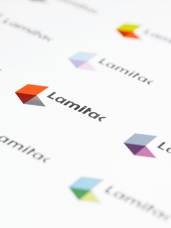
[vc_row row_type="row" use_row_as_full_screen_section="no" type="grid" text_align="left" background_image="350211" box_shadow_on_row="no" el_class="y3insidebanner"][vc_column css=".vc_custom_1463731956110{margin-top: 30px !important;}"][vc_empty_space height="100" image_repeat="no-repeat"][vc_column_text] TAK & LAMITAK Inspiring spaces for life [/vc_column_text][vc_empty_space height="200" image_repeat="no-repeat"][/vc_column][/vc_row][vc_row row_type="row" use_row_as_full_screen_section="no" type="grid" text_align="left" box_shadow_on_row="no"][vc_column css=".vc_custom_1463731956110{margin-top: 30px !important;}"][vc_column_text][sb-view-breadcrumb][/vc_column_text][/vc_column][/vc_row][vc_row row_type="row" use_row_as_full_screen_section="no" type="grid" text_align="left" box_shadow_on_row="no"][vc_column width="5/6"][vc_empty_space height="32" image_repeat="no-repeat"][vc_column_text el_class="h1-title"] From surfaces, to spaces that inspire with designs that create new possibilities. [/vc_column_text][vc_empty_space height="32" image_repeat="no-repeat"][/vc_column][/vc_row][vc_row row_type="row" use_row_as_full_screen_section="no" type="grid" text_align="left" box_shadow_on_row="no"][vc_column width="1/4"][vc_separator type="normal" up_style="px" down_style="px"][/vc_column][vc_column width="1/4"][/vc_column][vc_column width="1/4"][/vc_column][vc_column width="1/4"][/vc_column][/vc_row][vc_row row_type="row" use_row_as_full_screen_section="no" type="grid" text_align="left" box_shadow_on_row="no"][vc_column width="1/4"][vc_empty_space height="12" image_repeat="no-repeat"][vc_single_image image="351213" img_size="full"][vc_empty_space height="12" image_repeat="no-repeat"][vc_column_text] Singapore Design Awards 2010 Logo (Bronze) [/vc_column_text][/vc_column][vc_column width="1/6"][/vc_column][/vc_row][vc_row row_type="row" use_row_as_full_screen_section="no" type="grid" text_align="left" box_shadow_on_row="no"][vc_column][vc_empty_space image_repeat="no-repeat"][vc_single_image image="350208" img_size="full"][/vc_column][/vc_row][vc_row row_type="row" use_row_as_full_screen_section="no" type="grid" text_align="left" box_shadow_on_row="no"][vc_column width="1/2"][vc_empty_space image_repeat="no-repeat"][vc_column_text] The Challenge TAK is Asia’s leading independent producer of interior laminates and finishes. Competing against well-established brands, both global and local, the TAK brand needed to create a differentiated brand strategy and proposition that would fulfill customers’ needs and aspirations through a strong design-led combination of innovative products and services that inspire. [/vc_column_text][vc_empty_space image_repeat="no-repeat"][vc_column_text] The Insight For TAK, we developed the brand proposition 'Choices' – the possibilities that customers are availed of through its range of innovative, exciting and quality products – from the everyday to the unusual. Lamitak, TAK’s product brand, however, is all about creativity and inspiration. [/vc_column_text][/vc_column][vc_column width="1/2"][vc_empty_space image_repeat="no-repeat"][vc_single_image image="350205" img_size="full"][/vc_column][/vc_row][vc_row row_type="row" use_row_as_full_screen_section="no" type="grid" text_align="left" box_shadow_on_row="no"][vc_column width="1/2"][vc_empty_space image_repeat="no-repeat"][vc_single_image image="350206" img_size="full"][/vc_column][vc_column width="1/2"][vc_empty_space image_repeat="no-repeat"][vc_single_image image="350207" img_size="full"][/vc_column][/vc_row][vc_row row_type="row" use_row_as_full_screen_section="no" type="grid" text_align="left" box_shadow_on_row="no"][vc_column width="1/2"][vc_empty_space image_repeat="no-repeat"][vc_single_image image="350209" img_size="full"][/vc_column][vc_column width="1/2"][vc_empty_space image_repeat="no-repeat"][vc_column_text] TAK’s brand expression illustrates the recognisable graphic features that make its signature unique, whereas the Lamitak identity is an expression of its own brand personality, trendy, creative and fun. The symbol formed by transforming a square laminate swatch into a three-dimensional space in the form of an 'L' reflects the brand’s mission to educate, excite and create inspiring spaces. The deliberate similarity between the two identities express the relationship between the two brands but also the individuality that each brings to the market place.[/vc_column_text][vc_empty_space image_repeat="no-repeat"][vc_column_text] The...
[vc_row row_type="row" use_row_as_full_screen_section="no" type="grid" text_align="left" background_image="350534" box_shadow_on_row="no" el_class="y3insidebanner"][vc_column css=".vc_custom_1463731956110{margin-top: 30px !important;}"][vc_empty_space height="100" image_repeat="no-repeat"][vc_column_text] NATURE'S WONDER Life’s natural treats! [/vc_column_text][vc_empty_space height="200" image_repeat="no-repeat"][/vc_column][/vc_row][vc_row row_type="row" use_row_as_full_screen_section="no" type="grid" text_align="left" box_shadow_on_row="no"][vc_column css=".vc_custom_1463731956110{margin-top: 30px !important;}"][vc_column_text][sb-view-breadcrumb][/vc_column_text][/vc_column][/vc_row][vc_row row_type="row" use_row_as_full_screen_section="no" type="grid" text_align="left" box_shadow_on_row="no"][vc_column width="5/6"][vc_empty_space height="32" image_repeat="no-repeat"][vc_column_text el_class="h1-title"] Bringing a traditional brand to life and elevating its proposition for growth. [/vc_column_text][vc_empty_space height="32" image_repeat="no-repeat"][/vc_column][/vc_row][vc_row row_type="row" use_row_as_full_screen_section="no" type="grid" text_align="left" box_shadow_on_row="no"][vc_column width="1/4"][vc_separator type="normal" up_style="px" down_style="px"][/vc_column][vc_column width="1/4"][/vc_column][vc_column width="1/4"][/vc_column][vc_column width="1/4"][/vc_column][/vc_row][vc_row row_type="row" use_row_as_full_screen_section="no" type="grid" text_align="left" box_shadow_on_row="no"][vc_column width="1/4"][vc_empty_space height="12" image_repeat="no-repeat"][vc_single_image image="351216" img_size="full"][vc_empty_space height="12" image_repeat="no-repeat"][vc_column_text] Marketing Excellence Awards 2012 Packaging Design (Gold) [/vc_column_text][/vc_column][vc_column width="1/6"][/vc_column][/vc_row][vc_row row_type="row" use_row_as_full_screen_section="no" type="grid" text_align="left" box_shadow_on_row="no"][vc_column width="1/2"][vc_empty_space image_repeat="no-repeat"][vc_single_image image="350536" img_size="full"][/vc_column][vc_column width="1/2"][vc_empty_space image_repeat="no-repeat"][vc_column_text] The Challenge Nature’s Wonders, a healthier range of nuts from Tai Sun, is amongst one of the best quality dry roasted nuts in the market. Consumer research however, showed that the brand had very low awareness and retail visibility, and was perceived as being expensive. To help the brand unlock its value, Tai Sun saw that a clearer proposition was needed.[/vc_column_text][/vc_column][/vc_row][vc_row row_type="row" use_row_as_full_screen_section="no" type="grid" text_align="left" box_shadow_on_row="no"][vc_column][vc_empty_space image_repeat="no-repeat"][vc_single_image image="350537" img_size="full"][vc_empty_space image_repeat="no-repeat"][/vc_column][/vc_row][vc_row row_type="row" use_row_as_full_screen_section="no" type="grid" text_align="left" box_shadow_on_row="no"][vc_column width="1/2"][vc_column_text] The Insight Consumers are increasingly choosing pure and natural healthy snacks over unhealthy ones. In this context, nature plays a crucial role in developing the right cues for the consumer to accept the brand as ‘pure’ and ‘natural’. DIA helped create an impactful positioning for the brand by leveraging its name and crafting a brand story built on the idea of ‘natural good living’. The packaging captured healthy, nature-based imagery infused with elements of dynamism and style to enhance its ‘pick up’ value. The brand tagline ‘Life’s natural treats’ reinforced the purity of the nuts, reminding us that Nature’s bounty provides us with natural treats. [/vc_column_text][vc_empty_space image_repeat="no-repeat"][vc_column_text] The Impact Nature’s Wonders enjoyed resounding approval amongst the trade resulting in a move from lower-shelf to eye-level display, a move that boost revenue by 65% within three months of launch without additional advertising budget....
[vc_row row_type="row" use_row_as_full_screen_section="no" type="grid" text_align="left" background_image="349886" box_shadow_on_row="no" el_class="y3insidebanner"][vc_column css=".vc_custom_1463731956110{margin-top: 30px !important;}"][vc_empty_space height="100" image_repeat="no-repeat"][vc_column_text] CIVIL AVIATION AUTHORITY OF SINGAPORE Enabling opportunities through aviation [/vc_column_text][vc_empty_space height="200" image_repeat="no-repeat"][/vc_column][/vc_row][vc_row row_type="row" use_row_as_full_screen_section="no" type="grid" text_align="left" box_shadow_on_row="no"][vc_column css=".vc_custom_1463731956110{margin-top: 30px !important;}"][vc_column_text][sb-view-breadcrumb][/vc_column_text][/vc_column][/vc_row][vc_row row_type="row" use_row_as_full_screen_section="no" type="grid" text_align="left" box_shadow_on_row="no"][vc_column][vc_empty_space height="32" image_repeat="no-repeat"][vc_column_text el_class="h1-title"] A new direction for Singapore’s aviation authority, growing a city, connecting the world. [/vc_column_text][vc_empty_space height="32" image_repeat="no-repeat"][/vc_column][/vc_row][vc_row row_type="row" use_row_as_full_screen_section="no" type="grid" text_align="left" box_shadow_on_row="no"][vc_column width="1/4"][vc_separator type="normal" up_style="px" down_style="px"][/vc_column][vc_column width="1/4"][/vc_column][vc_column width="1/4"][/vc_column][vc_column width="1/4"][/vc_column][/vc_row][vc_row row_type="row" use_row_as_full_screen_section="no" type="grid" text_align="left" box_shadow_on_row="no"][vc_column width="1/4"][vc_empty_space height="12" image_repeat="no-repeat"][vc_single_image image="351213" img_size="full"][vc_empty_space height="12" image_repeat="no-repeat"][vc_column_text] Singapore Design Awards 2009 Brand Identity (Merit) [/vc_column_text][/vc_column][vc_column width="1/6"][/vc_column][/vc_row][vc_row row_type="row" use_row_as_full_screen_section="no" type="full_width" text_align="left" box_shadow_on_row="no"][vc_column][vc_empty_space image_repeat="no-repeat"][/vc_column][/vc_row][vc_row row_type="row" use_row_as_full_screen_section="no" type="grid" text_align="left" box_shadow_on_row="no"][vc_column width="1/2"][vc_single_image image="349887" img_size="full"][/vc_column][vc_column width="1/2"][vc_single_image image="349883" img_size="full"][/vc_column][/vc_row][vc_row row_type="row" use_row_as_full_screen_section="no" type="grid" text_align="left" box_shadow_on_row="no"][vc_column width="1/2"][vc_empty_space image_repeat="no-repeat"][vc_column_text] The Challenge As an enabler of the civil aviation sector, CAAS promotes and develops the aviation industry in Singapore, and expands the nation’s links to the rest of the world. Having reliquished its role as operator of Changi Airport, CAAS needed to develop a new vision and mission to help re-define its role. [/vc_column_text][vc_empty_space image_repeat="no-repeat"][vc_single_image image="349884" img_size="full"][vc_empty_space image_repeat="no-repeat"][vc_column_text] The Insight Through research with internal and external stakeholders and a series of management workshops the new vision “A leader in civil aviation; a city connecting the world” was developed that positions CAAS at the heart of Singapore’s economic development. Its new mission “To grow a safe, vibrant air hub and civil aviation system, making a key contribution to Singapore’s success” emphasises the organisation’s focus on enabling opportunities through aviation. DIA also helped to crystallise a set of core values around Safety, People, Integrity, Customers and Excellence, bringing about a belief system that is guiding CAAS in all its decisions and actions. The new CAAS is expressed in a refreshed brand identity that has been applied across all CAAS communications and anchors the new brand positioning for the future.[/vc_column_text][/vc_column][vc_column width="1/2"][vc_empty_space image_repeat="no-repeat"][vc_single_image image="349885" img_size="full"][vc_empty_space image_repeat="no-repeat"][vc_column_text] The Impact The new vision has helped focus CAAS’ strategic agenda in...
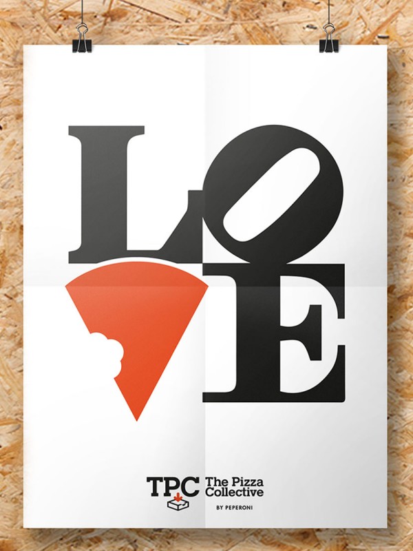
[vc_row row_type="row" use_row_as_full_screen_section="no" type="grid" text_align="left" background_image="349833" box_shadow_on_row="no" el_class="y3insidebanner"][vc_column css=".vc_custom_1463731956110{margin-top: 30px !important;}"][vc_empty_space height="100" image_repeat="no-repeat"][vc_column_text] THE PIZZA COLLECTIVE Live the moment [/vc_column_text][vc_empty_space height="200" image_repeat="no-repeat"][/vc_column][/vc_row][vc_row row_type="row" use_row_as_full_screen_section="no" type="grid" text_align="left" box_shadow_on_row="no"][vc_column css=".vc_custom_1463731956110{margin-top: 30px !important;}"][vc_column_text][sb-view-breadcrumb][/vc_column_text][/vc_column][/vc_row][vc_row row_type="row" use_row_as_full_screen_section="no" type="grid" text_align="left" box_shadow_on_row="no"][vc_column][vc_empty_space image_repeat="no-repeat"][vc_column_text el_class="h1-title"] More than a destination for pizza lovers, TPC is for a generation that ‘lives the moment’. [/vc_column_text][/vc_column][/vc_row][vc_row row_type="row" use_row_as_full_screen_section="no" type="grid" text_align="left" box_shadow_on_row="no"][vc_column][vc_empty_space image_repeat="no-repeat"][vc_single_image image="349832" img_size="full"][/vc_column][/vc_row][vc_row row_type="row" use_row_as_full_screen_section="no" type="grid" text_align="left" box_shadow_on_row="no"][vc_column width="1/2"][vc_empty_space image_repeat="no-repeat"][vc_column_text] The Challenge Riding on the success of Peperoni Pizzeria, a new opportunity arose to extend into the growing fast casual dining space, targeted specifically at today’s trendy millennial generation. The challenge is to get in front of them in their crowded and highly social world. [/vc_column_text][vc_empty_space image_repeat="no-repeat"][vc_column_text] The Insight “The Pizza Collective” or “TPC” conjures an image of trendy edginess and stands for a community of pizza lovers who enjoy creating and sharing life’s best moments, and the many different ways pizza can be shared for fun. The brand was brought to life through witty slogans and a suite of icons peppered on merchandise and throughout the store environment designed to evoke the immediacy of express delivery. The “#I***TPC” hashtag was also created to support its social media strategy, expressing the diverse emotions and memorable moments they experience through TPC.[/vc_column_text][vc_empty_space height="35px" image_repeat="no-repeat"][vc_single_image image="349834" img_size="full"][/vc_column][vc_column width="1/2"][vc_empty_space image_repeat="no-repeat"][vc_single_image image="349835" img_size="full"][vc_empty_space image_repeat="no-repeat"][vc_single_image image="349837" img_size="full"][vc_empty_space image_repeat="no-repeat"][vc_single_image image="349838" img_size="full"][/vc_column][/vc_row][vc_row row_type="row" use_row_as_full_screen_section="no" type="grid" text_align="left" box_shadow_on_row="no"][vc_column][vc_empty_space image_repeat="no-repeat"][vc_single_image image="349841" img_size="full"][/vc_column][/vc_row][vc_row row_type="row" use_row_as_full_screen_section="no" type="grid" text_align="left" box_shadow_on_row="no"][vc_column][vc_empty_space image_repeat="no-repeat"][vc_separator type="normal" color="#666666" thickness="1" up_style="px" down_style="px"][/vc_column][/vc_row][vc_row row_type="row" use_row_as_full_screen_section="no" type="grid" text_align="left" box_shadow_on_row="no"][vc_column width="1/2"][vc_empty_space height="12px" image_repeat="no-repeat"][vc_column_text][workcategories][/vc_column_text][vc_empty_space height="12px" image_repeat="no-repeat"][/vc_column][vc_column width="1/2"][/vc_column][/vc_row][vc_row row_type="row" use_row_as_full_screen_section="no" type="grid" text_align="left" box_shadow_on_row="no"][vc_column][vc_separator type="normal" color="#666666" thickness="1" up_style="px" down_style="px"][/vc_column][/vc_row][vc_row row_type="row" use_row_as_full_screen_section="no" type="grid" text_align="left" box_shadow_on_row="no" el_class="displaynone-1"][vc_column][vc_column_text][relatedwork selected_projects="349813,349861,350137"][/vc_column_text][/vc_column][/vc_row][vc_row row_type="row" use_row_as_full_screen_section="no" type="grid" text_align="left" box_shadow_on_row="no"][vc_column][vc_empty_space height="12px" image_repeat="no-repeat"][vc_separator type="normal" color="#666666" thickness="1" up_style="px" down_style="px"][/vc_column][/vc_row]...
[vc_row row_type="row" use_row_as_full_screen_section="no" type="grid" text_align="left" background_image="352942" box_shadow_on_row="no" el_class="y3insidebanner"][vc_column css=".vc_custom_1463731956110{margin-top: 30px !important;}"][vc_empty_space height="100" image_repeat="no-repeat"][vc_column_text] OLAM The brand behind the brands [/vc_column_text][vc_empty_space height="200" image_repeat="no-repeat"][/vc_column][/vc_row][vc_row row_type="row" use_row_as_full_screen_section="no" type="grid" text_align="left" box_shadow_on_row="no"][vc_column css=".vc_custom_1463731956110{margin-top: 30px !important;}"][vc_column_text][sb-view-breadcrumb][/vc_column_text][/vc_column][/vc_row][vc_row row_type="row" use_row_as_full_screen_section="no" type="grid" text_align="left" box_shadow_on_row="no"][vc_column width="5/6"][vc_empty_space height="32" image_repeat="no-repeat"][vc_column_text el_class="h1-title"] From one product in one country, to 20 products in 70 countries and $20b revenue in 25 years. [/vc_column_text][vc_empty_space height="32" image_repeat="no-repeat"][/vc_column][vc_column width="1/6"][/vc_column][/vc_row][vc_row row_type="row" use_row_as_full_screen_section="no" type="grid" text_align="left" box_shadow_on_row="no"][vc_column width="1/4"][vc_separator type="normal" up_style="px" down_style="px"][/vc_column][vc_column width="1/4"][/vc_column][vc_column width="1/4"][/vc_column][vc_column width="1/4"][/vc_column][/vc_row][vc_row row_type="row" use_row_as_full_screen_section="no" type="grid" text_align="left" box_shadow_on_row="no"][vc_column width="1/4"][vc_empty_space height="12" image_repeat="no-repeat"][vc_single_image image="351216" img_size="full"][vc_empty_space height="12" image_repeat="no-repeat"][vc_column_text] Marketing Excellence Awards 2013 Excellence in Corporate Social Responsibility (Silver) [/vc_column_text][/vc_column][vc_column width="1/6"][/vc_column][/vc_row][vc_row row_type="row" use_row_as_full_screen_section="no" type="full_width" text_align="left" box_shadow_on_row="no"][vc_column][/vc_column][/vc_row][vc_row row_type="row" use_row_as_full_screen_section="no" type="grid" text_align="left" box_shadow_on_row="no"][vc_column width="1/2"][vc_empty_space image_repeat="no-repeat"][vc_single_image image="350158" img_size="full"][/vc_column][vc_column width="1/2"][vc_empty_space image_repeat="no-repeat"][vc_single_image image="350159" img_size="full"][/vc_column][/vc_row][vc_row row_type="row" use_row_as_full_screen_section="no" type="grid" text_align="left" box_shadow_on_row="no"][vc_column width="1/2"][vc_empty_space image_repeat="no-repeat"][vc_column_text] The Challenge Olam was founded in 1989 in Nigeria with cashew as its first product. In 1998 Olam saw the need to evolve and develop its brand to a new level in the global market, and for the brand to be a platform for unifying the company across its diverse businesses and geographies. [/vc_column_text][/vc_column][vc_column width="1/2"][/vc_column][/vc_row][vc_row row_type="row" use_row_as_full_screen_section="no" type="grid" text_align="left" box_shadow_on_row="no"][vc_column][vc_empty_space image_repeat="no-repeat"][vc_single_image image="350160" img_size="full"][/vc_column][/vc_row][vc_row row_type="row" use_row_as_full_screen_section="no" type="grid" text_align="left" box_shadow_on_row="no"][vc_column width="1/2"][vc_empty_space image_repeat="no-repeat"][vc_single_image image="350162" img_size="full"][/vc_column][vc_column width="1/2"][vc_empty_space image_repeat="no-repeat"][vc_single_image image="350163" img_size="full"][/vc_column][/vc_row][vc_row row_type="row" use_row_as_full_screen_section="no" type="grid" text_align="left" box_shadow_on_row="no"][vc_column width="1/2"][vc_empty_space image_repeat="no-repeat"][vc_column_text] The Insight DIA helped articulate the guiding principles of the Olam brand, as enshrined in the ‘Olam way’ of value addition over time. This was communicated through a refreshed brand identity system and the tagline ‘Creating Value Is Our Business’ that became the standard bearer for the Olam philosophy. This was captured in an evolved brand identity system to unify its businesses globally. In 2004 Olam took the decision to list the company and DIA helped communicate Olam’s complex businesses in a way that could be easily understood by investors and would reflect the genuine value of the company and its potential for growth. The resulting proposition ‘The Brand Behind...
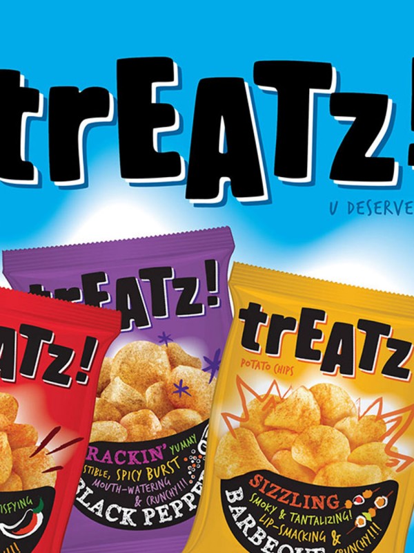
[vc_row row_type="row" use_row_as_full_screen_section="no" type="grid" text_align="left" background_image="350589" box_shadow_on_row="no" el_class="y3insidebanner"][vc_column css=".vc_custom_1463731956110{margin-top: 30px !important;}"][vc_empty_space height="100" image_repeat="no-repeat"][vc_column_text] TREATZ U deserve it [/vc_column_text][vc_empty_space height="200" image_repeat="no-repeat"][/vc_column][/vc_row][vc_row row_type="row" use_row_as_full_screen_section="no" type="grid" text_align="left" box_shadow_on_row="no"][vc_column css=".vc_custom_1463731956110{margin-top: 30px !important;}"][vc_column_text][sb-view-breadcrumb][/vc_column_text][/vc_column][/vc_row][vc_row row_type="row" use_row_as_full_screen_section="no" type="grid" text_align="left" box_shadow_on_row="no"][vc_column][vc_empty_space image_repeat="no-repeat"][vc_column_text el_class="h1-title"] Connecting to today’s young teens with a brand that speaks their language. [/vc_column_text][/vc_column][/vc_row][vc_row row_type="row" use_row_as_full_screen_section="no" type="grid" text_align="left" box_shadow_on_row="no"][vc_column width="1/2"][vc_empty_space image_repeat="no-repeat"][vc_column_text] The Challenge The Tai Sun chips brand had been facing issues of low awareness, poor brand image and an undefined positioning, all of which were pointing towards gradual market decline especially in the midst of stiff competition from international brands with deeper pockets. [/vc_column_text][/vc_column][vc_column width="1/2"][vc_empty_space image_repeat="no-repeat"][vc_single_image image="350590" img_size="full"][/vc_column][/vc_row][vc_row row_type="row" use_row_as_full_screen_section="no" type="grid" text_align="left" box_shadow_on_row="no"][vc_column][vc_empty_space image_repeat="no-repeat"][vc_single_image image="350591" img_size="full"][/vc_column][/vc_row][vc_row row_type="row" use_row_as_full_screen_section="no" type="grid" text_align="left" box_shadow_on_row="no"][vc_column width="1/2"][vc_empty_space image_repeat="no-repeat"][vc_single_image image="350593" img_size="full"][vc_empty_space image_repeat="no-repeat"][vc_single_image image="350592" img_size="full"][/vc_column][vc_column width="1/2"][vc_empty_space image_repeat="no-repeat"][vc_column_text] The Insight An audit of the brand revealed that there was no lack of product innovation but a boost in image and pick me up value was needed to revitalise the brand and create a reason to believe for both trade and consumers. DIA created a new name “Treatz” to appeal to young consumers, as well as mums shopping for the school bag. This was supported by the tagline “U deserve it” to suggest that potato chips are a treat for all to enjoy, and a must for fun times and relaxing occasions. The brand was launched with a fresh, youthful packaging that attracts today’s young consumers with a high ‘pick me up’ quotient. Bright colours and conversational packaging design made the brand very well received at both the consumer and trade level. [/vc_column_text][vc_empty_space image_repeat="no-repeat"][vc_column_text] The Impact Today Treatz sits alongside other international brands and continues to hold its own with an innovative range of exciting flavours that were developed as a platform for the re-launch, making it a mainstay with the young and young at heart. [/vc_column_text][/vc_column][/vc_row][vc_row row_type="row" use_row_as_full_screen_section="no" type="grid" text_align="left" box_shadow_on_row="no"][vc_column][vc_empty_space image_repeat="no-repeat"][vc_separator type="normal" color="#666666" thickness="1" up_style="px" down_style="px"][/vc_column][/vc_row][vc_row...
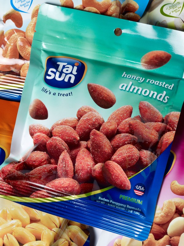
[vc_row row_type="row" use_row_as_full_screen_section="no" type="grid" text_align="left" background_image="350580" box_shadow_on_row="no" el_class="y3insidebanner"][vc_column css=".vc_custom_1463731956110{margin-top: 30px !important;}"][vc_empty_space height="100" image_repeat="no-repeat"][vc_column_text] TAI SUN Goodness in Everything [/vc_column_text][vc_empty_space height="200" image_repeat="no-repeat"][/vc_column][/vc_row][vc_row row_type="row" use_row_as_full_screen_section="no" type="grid" text_align="left" box_shadow_on_row="no"][vc_column css=".vc_custom_1463731956110{margin-top: 30px !important;}"][vc_column_text][sb-view-breadcrumb][/vc_column_text][/vc_column][/vc_row][vc_row row_type="row" use_row_as_full_screen_section="no" type="grid" text_align="left" box_shadow_on_row="no"][vc_column][vc_empty_space height="32" image_repeat="no-repeat"][vc_column_text el_class="h1-title"] Seeding for success in a cluttered marketplace [/vc_column_text][vc_empty_space height="32" image_repeat="no-repeat"][/vc_column][/vc_row][vc_row row_type="row" use_row_as_full_screen_section="no" type="grid" text_align="left" box_shadow_on_row="no"][vc_column width="1/4"][vc_separator type="normal" up_style="px" down_style="px"][/vc_column][vc_column width="1/4"][/vc_column][vc_column width="1/4"][/vc_column][vc_column width="1/4"][/vc_column][/vc_row][vc_row row_type="row" use_row_as_full_screen_section="no" type="grid" text_align="left" box_shadow_on_row="no"][vc_column width="1/4"][vc_empty_space height="12" image_repeat="no-repeat"][vc_single_image image="351216" img_size="full"][vc_empty_space height="12" image_repeat="no-repeat"][vc_column_text] Marketing Excellence Awards 2012 Excellence in Packaging Design (Bronze) [/vc_column_text][/vc_column][vc_column width="1/6"][/vc_column][/vc_row][vc_row row_type="row" use_row_as_full_screen_section="no" type="grid" text_align="left" box_shadow_on_row="no"][vc_column][vc_empty_space image_repeat="no-repeat"][vc_single_image image="350581" img_size="full"][/vc_column][/vc_row][vc_row row_type="row" use_row_as_full_screen_section="no" type="grid" text_align="left" box_shadow_on_row="no"][vc_column width="1/2"][vc_empty_space image_repeat="no-repeat"][vc_single_image image="350586" img_size="full"][/vc_column][vc_column width="1/2"][vc_empty_space image_repeat="no-repeat"][vc_single_image image="350582" img_size="full"][/vc_column][/vc_row][vc_row row_type="row" use_row_as_full_screen_section="no" type="grid" text_align="left" box_shadow_on_row="no"][vc_column width="1/2"][vc_empty_space image_repeat="no-repeat"][vc_column_text] The Challenge Tai Sun Nuts is a trusted product but the brand lacked the appeal and dynamism to become the first choice of the trade and consumers. It was also struggling to grow sales in an increasingly competitive category against well established traditional and international rivals. [/vc_column_text][vc_empty_space image_repeat="no-repeat"][vc_column_text] The Insight Research revealed that while consumers enjoyed snacking on nuts, they found them expensive and out of reach for frequent consumption. Bridging the gap through a ‘mass appeal’ proposition aligns with Tai Sun’s belief that good living should not be the privilege of only a select few. Supported by Tai Sun’s trusted family heritage, DIA helped distill the corporate brand essence to “Goodness in Everything”, delivered through the brand tagline “Life’s a treat”, communicating nuts as the healthy snack choice. The Tai Sun range packaging has been refreshed to exude warmth and friendliness, reflecting its earnest belief in making snacks with care and quality. Product photography has been enhanced to improve appetite appeal and the design has created a powerful brand presence on shelf. [/vc_column_text][vc_empty_space image_repeat="no-repeat"][vc_column_text] The Impact The consumer and trade responded very positively to the revitalised Tai Sun branding and the product was swiftly moved from bottom shelves to more premium shelf space in-store resulting in...


