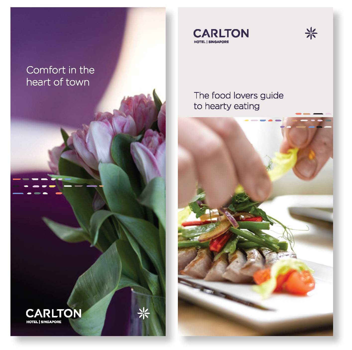
Re-positioning Carlton Hotel as Singapore’s leading independent hotel brand to capture business travellers in “the heart of the city”.

Singapore Design Awards 2010
Brand Identity (Silver)

The Challenge
The launch of a new wing for the 20-year old hotel demanded that Carlton relook at its brand positioning and refresh its dated persona. This was especially important against a landscape of booming tourist arrivals and as iconic destination hotels such as Marina Bay Sands and Resorts World Sentosa opened their doors.
The Insight
A melting pot of cultures and flavours, Singapore had served as a trading hub since its early days and continues to play the role as one of Asia’s most important commercial centres.
Carlton’s location at one of Singapore’s busiest junctions in the heart of the city supports the notion of a hub, giving inspiration to the essence ‘Best of Singapore’ as the hotel reflects everything that is at the heart of the city.
The idea of convergence has been captured in Carlton’s brand identity which took inspiration from grains of rice, in reference to the hotel’s location at Bras Basah, originally beras basah, which is Malay for ‘wet rice’, and is Singapore’s original rice market.
We went on to develop the identity and designs for Carlton’s Café Mosaic all day dining, Gravity Bar and Equator@Poolside Bar.
The Impact
A clearer definition of the brand fundamentals guides Carlton in the way it manages service quality and approaches interaction with customers and business partners. The success of Carlton Hotel post-rebranding is evident in the development of their award-winning second property, Carlton City Hotel, which upheld the same brand positioning and identity as its predecessor.


