65 unions, 13 social enterprises, 8,000 staff, 500,000 members… one vision, one unifying identity.

Singapore Design Awards 2009
Brand Identity (Gold)
The Challenge
A review of the NTUC and the Singapore Labour Movement in 2006 revealed that the needs of Singapore working families were radically changing. In this age of globalisation and a continuous shift towards a knowledge-based economy, there was a critical need to reposition the Labour Movement so that it remains relevant to the modern generation of working families and support the movement’s drive towards a more inclusive nation.
The Insight
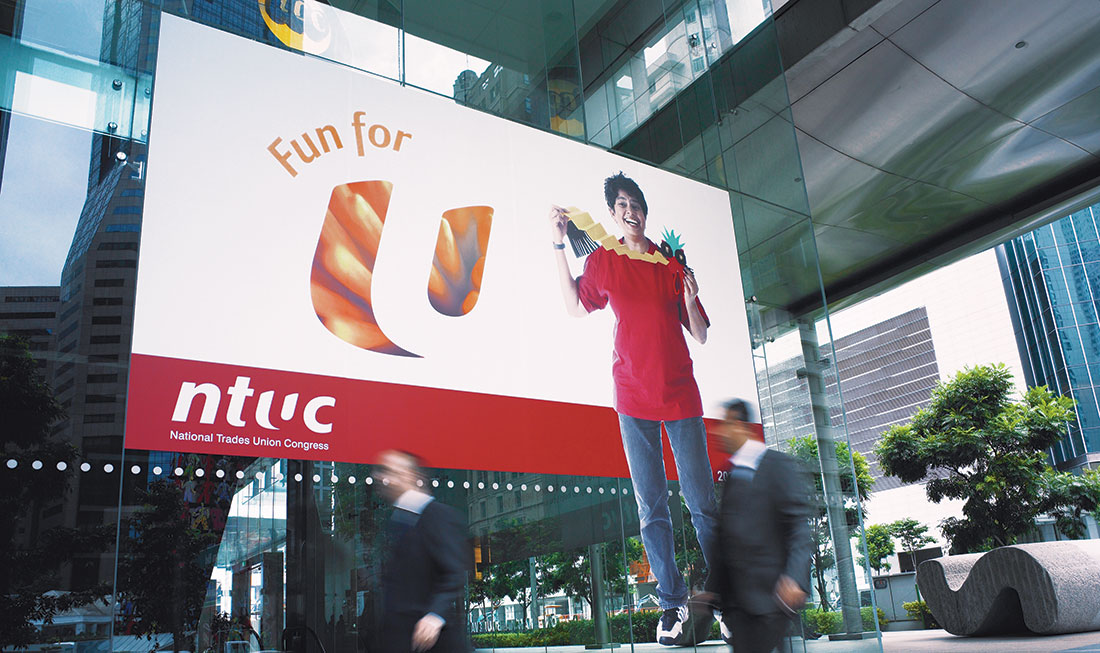
A wide-ranging research programme and consultation with Labour Movement leaders at a three-day retreat in Zuhai, China resulted in a powerful new direction for NTUC and the Labour Movement. This was translated into a dynamic new identity, expressed in a vision of ‘a better and more meaningful life for all’ to re-focus NTUC’s mission across its 13 Social Enterprises. This was then anchored by the design of a distinctive ‘U’ hallmark that expresses the three pillars of the Labour Movement: the ‘small u’ that stands for you, working people and their families; the ‘Big U’ that stands for the Labour Movement of 65 unions and 13 social enterprises; and the ‘invisible u’ that stands beside you, supporting you in good times or bad.


The Impact
The NTUC hallmark has since been implemented across all NTUC’s operations and that of its social enterprises, bringing to bear the vision of being a partner to the modern working family’s life journey.