[vc_row row_type="row" use_row_as_full_screen_section="no" type="grid" text_align="left" background_image="349928" box_shadow_on_row="no" el_class="y3insidebanner"][vc_column css=".vc_custom_1463731956110{margin-top: 30px !important;}"][vc_empty_space height="100" image_repeat="no-repeat"][vc_column_text] DUNLOPILLO Rethinking mattress retailing [/vc_column_text][vc_empty_space height="200" image_repeat="no-repeat"][/vc_column][/vc_row][vc_row row_type="row" use_row_as_full_screen_section="no" type="grid" text_align="left" box_shadow_on_row="no"][vc_column css=".vc_custom_1463731956110{margin-top: 30px !important;}"][vc_column_text][sb-view-breadcrumb][/vc_column_text][/vc_column][/vc_row][vc_row row_type="row" use_row_as_full_screen_section="no" type="grid" text_align="left" box_shadow_on_row="no"][vc_column][vc_empty_space height="32" image_repeat="no-repeat"][vc_column_text el_class="h1-title"] Revitalising the brand Dunlopillo and revolutionising the mattress retailing experience. [/vc_column_text][vc_empty_space height="32" image_repeat="no-repeat"][/vc_column][/vc_row][vc_row row_type="row" use_row_as_full_screen_section="no" type="grid" text_align="left" box_shadow_on_row="no"][vc_column width="1/4"][vc_separator type="normal" up_style="px" down_style="px"][/vc_column][vc_column width="1/4"][/vc_column][vc_column width="1/4"][/vc_column][vc_column width="1/4"][/vc_column][/vc_row][vc_row row_type="row" use_row_as_full_screen_section="no" type="grid" text_align="left" box_shadow_on_row="no"][vc_column width="1/4"][vc_empty_space height="12" image_repeat="no-repeat"][vc_single_image image="351213" img_size="full"][vc_empty_space height="12" image_repeat="no-repeat"][vc_column_text] Singapore Design Awards 2012 Branding (Silver) [/vc_column_text][/vc_column][vc_column width="1/6"][/vc_column][/vc_row][vc_row row_type="row" use_row_as_full_screen_section="no" type="grid" text_align="left" box_shadow_on_row="no"][vc_column][vc_empty_space image_repeat="no-repeat"][vc_single_image image="349929" img_size="full"][/vc_column][/vc_row][vc_row row_type="row" use_row_as_full_screen_section="no" type="grid" text_align="left" box_shadow_on_row="no"][vc_column][vc_empty_space image_repeat="no-repeat"][vc_single_image image="350425" img_size="full"][/vc_column][/vc_row][vc_row row_type="row" use_row_as_full_screen_section="no" type="grid" text_align="left" box_shadow_on_row="no"][vc_column width="1/2"][vc_empty_space image_repeat="no-repeat"][vc_column_text] The Challenge Staying relevant in changing times is one of the key challenges that a veteran brand faces. We were entrusted with the challenge to transform the retail brand by finding new ways for consumers to experience and resonate with the brand. [/vc_column_text][vc_empty_space image_repeat="no-repeat"][vc_single_image image="349932" img_size="full"][vc_empty_space image_repeat="no-repeat"][vc_column_text] The Impact Rapid prototyping was done with dealers throughout Malaysia to ensure that the new Dunlopillo way was set to WOW and continued to create special moments for its customers day after day. [/vc_column_text][/vc_column][vc_column width="1/2"][vc_empty_space image_repeat="no-repeat"][vc_single_image image="349931" img_size="full"][vc_empty_space image_repeat="no-repeat"][vc_column_text] The Insight Pushing the boundaries of insight and foresight through extensive research, competitive studies and retail experience audits, we helped the Dunlopillo team take imaginative leaps into the future.   Perfecting the art of sleep, we redefined Dunlopillo’s association, beyond functional mattresses to ‘celebrating special moments’. Positioning Dunlopillo as a trusted brand that has always been there to care for the wellbeing of families, we are in fact, helping people make the most of their awake moments by helping them get the best sleep of their lives.   Thus began the transformation of the brand experience from mattress retailing to sleep consulting. Among many other notable initiatives were online sleep and mattress profiling, customer archetype based product innovation, customer-focused retail experience based on the concept of cocooning. [/vc_column_text][vc_empty_space image_repeat="no-repeat"][vc_single_image image="349933" img_size="full"][/vc_column][/vc_row][vc_row row_type="row"...

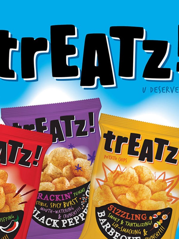
[vc_row row_type="row" use_row_as_full_screen_section="no" type="grid" text_align="left" background_image="350589" box_shadow_on_row="no" el_class="y3insidebanner"][vc_column css=".vc_custom_1463731956110{margin-top: 30px !important;}"][vc_empty_space height="100" image_repeat="no-repeat"][vc_column_text] TREATZ U deserve it [/vc_column_text][vc_empty_space height="200" image_repeat="no-repeat"][/vc_column][/vc_row][vc_row row_type="row" use_row_as_full_screen_section="no" type="grid" text_align="left" box_shadow_on_row="no"][vc_column css=".vc_custom_1463731956110{margin-top: 30px !important;}"][vc_column_text][sb-view-breadcrumb][/vc_column_text][/vc_column][/vc_row][vc_row row_type="row" use_row_as_full_screen_section="no" type="grid" text_align="left" box_shadow_on_row="no"][vc_column][vc_empty_space image_repeat="no-repeat"][vc_column_text el_class="h1-title"] Connecting to today’s young teens with a brand that speaks their language. [/vc_column_text][/vc_column][/vc_row][vc_row row_type="row" use_row_as_full_screen_section="no" type="grid" text_align="left" box_shadow_on_row="no"][vc_column width="1/2"][vc_empty_space image_repeat="no-repeat"][vc_column_text] The Challenge The Tai Sun chips brand had been facing issues of low awareness, poor brand image and an undefined positioning, all of which were pointing towards gradual market decline especially in the midst of stiff competition from international brands with deeper pockets. [/vc_column_text][/vc_column][vc_column width="1/2"][vc_empty_space image_repeat="no-repeat"][vc_single_image image="350590" img_size="full"][/vc_column][/vc_row][vc_row row_type="row" use_row_as_full_screen_section="no" type="grid" text_align="left" box_shadow_on_row="no"][vc_column][vc_empty_space image_repeat="no-repeat"][vc_single_image image="350591" img_size="full"][/vc_column][/vc_row][vc_row row_type="row" use_row_as_full_screen_section="no" type="grid" text_align="left" box_shadow_on_row="no"][vc_column width="1/2"][vc_empty_space image_repeat="no-repeat"][vc_single_image image="350593" img_size="full"][vc_empty_space image_repeat="no-repeat"][vc_single_image image="350592" img_size="full"][/vc_column][vc_column width="1/2"][vc_empty_space image_repeat="no-repeat"][vc_column_text] The Insight An audit of the brand revealed that there was no lack of product innovation but a boost in image and pick me up value was needed to revitalise the brand and create a reason to believe for both trade and consumers.   DIA created a new name “Treatz” to appeal to young consumers, as well as mums shopping for the school bag. This was supported by the tagline “U deserve it” to suggest that potato chips are a treat for all to enjoy, and a must for fun times and relaxing occasions. The brand was launched with a fresh, youthful packaging that attracts today’s young consumers with a high ‘pick me up’ quotient. Bright colours and conversational packaging design made the brand very well received at both the consumer and trade level. [/vc_column_text][vc_empty_space image_repeat="no-repeat"][vc_column_text] The Impact Today Treatz sits alongside other international brands and continues to hold its own with an innovative range of exciting flavours that were developed as a platform for the re-launch, making it a mainstay with the young and young at heart. [/vc_column_text][/vc_column][/vc_row][vc_row row_type="row" use_row_as_full_screen_section="no" type="grid" text_align="left" box_shadow_on_row="no"][vc_column][vc_empty_space image_repeat="no-repeat"][vc_separator type="normal" color="#666666" thickness="1" up_style="px" down_style="px"][/vc_column][/vc_row][vc_row...

[vc_row row_type="row" use_row_as_full_screen_section="no" type="grid" text_align="left" background_image="350580" box_shadow_on_row="no" el_class="y3insidebanner"][vc_column css=".vc_custom_1463731956110{margin-top: 30px !important;}"][vc_empty_space height="100" image_repeat="no-repeat"][vc_column_text] TAI SUN Goodness in Everything [/vc_column_text][vc_empty_space height="200" image_repeat="no-repeat"][/vc_column][/vc_row][vc_row row_type="row" use_row_as_full_screen_section="no" type="grid" text_align="left" box_shadow_on_row="no"][vc_column css=".vc_custom_1463731956110{margin-top: 30px !important;}"][vc_column_text][sb-view-breadcrumb][/vc_column_text][/vc_column][/vc_row][vc_row row_type="row" use_row_as_full_screen_section="no" type="grid" text_align="left" box_shadow_on_row="no"][vc_column][vc_empty_space height="32" image_repeat="no-repeat"][vc_column_text el_class="h1-title"] Seeding for success in a cluttered marketplace [/vc_column_text][vc_empty_space height="32" image_repeat="no-repeat"][/vc_column][/vc_row][vc_row row_type="row" use_row_as_full_screen_section="no" type="grid" text_align="left" box_shadow_on_row="no"][vc_column width="1/4"][vc_separator type="normal" up_style="px" down_style="px"][/vc_column][vc_column width="1/4"][/vc_column][vc_column width="1/4"][/vc_column][vc_column width="1/4"][/vc_column][/vc_row][vc_row row_type="row" use_row_as_full_screen_section="no" type="grid" text_align="left" box_shadow_on_row="no"][vc_column width="1/4"][vc_empty_space height="12" image_repeat="no-repeat"][vc_single_image image="351216" img_size="full"][vc_empty_space height="12" image_repeat="no-repeat"][vc_column_text] Marketing Excellence Awards 2012 Excellence in Packaging Design (Bronze) [/vc_column_text][/vc_column][vc_column width="1/6"][/vc_column][/vc_row][vc_row row_type="row" use_row_as_full_screen_section="no" type="grid" text_align="left" box_shadow_on_row="no"][vc_column][vc_empty_space image_repeat="no-repeat"][vc_single_image image="350581" img_size="full"][/vc_column][/vc_row][vc_row row_type="row" use_row_as_full_screen_section="no" type="grid" text_align="left" box_shadow_on_row="no"][vc_column width="1/2"][vc_empty_space image_repeat="no-repeat"][vc_single_image image="350586" img_size="full"][/vc_column][vc_column width="1/2"][vc_empty_space image_repeat="no-repeat"][vc_single_image image="350582" img_size="full"][/vc_column][/vc_row][vc_row row_type="row" use_row_as_full_screen_section="no" type="grid" text_align="left" box_shadow_on_row="no"][vc_column width="1/2"][vc_empty_space image_repeat="no-repeat"][vc_column_text] The Challenge Tai Sun Nuts is a trusted product but the brand lacked the appeal and dynamism to become the first choice of the trade and consumers. It was also struggling to grow sales in an increasingly competitive category against well established traditional and international rivals. [/vc_column_text][vc_empty_space image_repeat="no-repeat"][vc_column_text] The Insight Research revealed that while consumers enjoyed snacking on nuts, they found them expensive and out of reach for frequent consumption.   Bridging the gap through a ‘mass appeal’ proposition aligns with Tai Sun’s belief that good living should not be the privilege of only a select few. Supported by Tai Sun’s trusted family heritage, DIA helped distill the corporate brand essence to “Goodness in Everything”, delivered through the brand tagline “Life’s a treat”, communicating nuts as the healthy snack choice.   The Tai Sun range packaging has been refreshed to exude warmth and friendliness, reflecting its earnest belief in making snacks with care and quality. Product photography has been enhanced to improve appetite appeal and the design has created a powerful brand presence on shelf. [/vc_column_text][vc_empty_space image_repeat="no-repeat"][vc_column_text] The Impact The consumer and trade responded very positively to the revitalised Tai Sun branding and the product was swiftly moved from bottom shelves to more premium shelf space in-store resulting in...

[vc_row row_type="row" use_row_as_full_screen_section="no" type="grid" text_align="left" background_image="350869" box_shadow_on_row="no" el_class="y3insidebanner"][vc_column css=".vc_custom_1463731956110{margin-top: 30px !important;}"][vc_empty_space height="100" image_repeat="no-repeat"][vc_column_text] SLS Creating advantage [/vc_column_text][vc_empty_space height="200" image_repeat="no-repeat"][/vc_column][/vc_row][vc_row row_type="row" use_row_as_full_screen_section="no" type="grid" text_align="left" box_shadow_on_row="no"][vc_column css=".vc_custom_1463731956110{margin-top: 30px !important;}"][vc_column_text][sb-view-breadcrumb][/vc_column_text][/vc_column][/vc_row][vc_row row_type="row" use_row_as_full_screen_section="no" type="grid" text_align="left" box_shadow_on_row="no"][vc_column][vc_empty_space image_repeat="no-repeat"][vc_column_text el_class="h1-title"] From a vendor to a strategic partner, instrumental to business success. [/vc_column_text][/vc_column][/vc_row][vc_row row_type="row" use_row_as_full_screen_section="no" type="grid" text_align="left" box_shadow_on_row="no"][vc_column][vc_empty_space image_repeat="no-repeat"][vc_single_image image="350874" img_size="full"][/vc_column][/vc_row][vc_row row_type="row" use_row_as_full_screen_section="no" type="grid" text_align="left" box_shadow_on_row="no"][vc_column width="1/2"][vc_empty_space image_repeat="no-repeat"][vc_column_text] The Challenge SLS is a leading provider of mechanical components and high quality bearings and related products. However, its reputation is primarily driven by and over shadowed by its principal product brand. In light of plans to further expand its regional presence, there was a critical need that SLS build its own brand and market presence. [/vc_column_text][vc_empty_space image_repeat="no-repeat"][vc_column_text] The Insight We created a new strategic roadmap and a differentiated positioning for SLS that anchored the brand on the promise of ‘Creating Advantage’, expressing the tangible edge that SLS brings to its stakeholders. This is supported by its unmatched expertise in bearings and solutions, its experienced and qualified people, processes and an extensive strategic network.   The promise provided a catalyst for building internal brand culture, uniting staff across the region, attracting new talent and encouraging better talent management.   A strong and modernised identity was also created to reflect SLS’ new positioning and to support communications. [/vc_column_text][vc_empty_space image_repeat="no-repeat"][vc_column_text] The Impact Riding on the brand strategy and recommendations, SLS has gone on to set up SLS Pro and SLS Academy, respectively the services and training divisions of the business, and continues to establish itself as a forerunner in the space of mechanical components and engineering. [/vc_column_text][/vc_column][vc_column width="1/2"][vc_empty_space image_repeat="no-repeat"][vc_single_image image="350871" img_size="full"][vc_empty_space image_repeat="no-repeat"][vc_single_image image="350875" img_size="full"][/vc_column][/vc_row][vc_row row_type="row" use_row_as_full_screen_section="no" type="grid" text_align="left" box_shadow_on_row="no"][vc_column width="1/2"][vc_empty_space image_repeat="no-repeat"][vc_single_image image="350872" img_size="full"][/vc_column][vc_column width="1/2"][vc_empty_space image_repeat="no-repeat"][vc_single_image image="350873" img_size="full"][/vc_column][/vc_row][vc_row row_type="row" use_row_as_full_screen_section="no" type="full_width" text_align="left" box_shadow_on_row="no"][vc_column][vc_column_text] [/vc_column_text][/vc_column][/vc_row][vc_row row_type="row" use_row_as_full_screen_section="no" type="grid" text_align="left" box_shadow_on_row="no"][vc_column][vc_empty_space image_repeat="no-repeat"][vc_separator type="normal" color="#666666" thickness="1" up_style="px" down_style="px"][/vc_column][/vc_row][vc_row row_type="row" use_row_as_full_screen_section="no" type="grid" text_align="left" box_shadow_on_row="no"][vc_column width="1/2"][vc_empty_space height="12px" image_repeat="no-repeat"][vc_column_text][workcategories][/vc_column_text][vc_empty_space height="12px" image_repeat="no-repeat"][/vc_column][vc_column width="1/2"][/vc_column][/vc_row][vc_row row_type="row" use_row_as_full_screen_section="no" type="grid" text_align="left" box_shadow_on_row="no"][vc_column][vc_separator...

[vc_row row_type="row" use_row_as_full_screen_section="no" type="grid" text_align="left" background_image="350557" box_shadow_on_row="no" el_class="y3insidebanner"][vc_column css=".vc_custom_1463731956110{margin-top: 30px !important;}"][vc_empty_space height="100" image_repeat="no-repeat"][vc_column_text] SAMSUI Inspiring pride & joy [/vc_column_text][vc_empty_space height="150" image_repeat="no-repeat"][/vc_column][/vc_row][vc_row row_type="row" use_row_as_full_screen_section="no" type="grid" text_align="left" box_shadow_on_row="no"][vc_column css=".vc_custom_1463731956110{margin-top: 30px !important;}"][vc_column_text][sb-view-breadcrumb][/vc_column_text][/vc_column][/vc_row][vc_row row_type="row" use_row_as_full_screen_section="no" type="grid" text_align="left" box_shadow_on_row="no"][vc_column][vc_empty_space height="32" image_repeat="no-repeat"][vc_column_text el_class="h1-title"] Bringing back the love for home-cooked meals. [/vc_column_text][vc_empty_space height="32" image_repeat="no-repeat"][/vc_column][/vc_row][vc_row row_type="row" use_row_as_full_screen_section="no" type="grid" text_align="left" box_shadow_on_row="no"][vc_column width="1/4"][vc_separator type="normal" up_style="px" down_style="px"][/vc_column][vc_column width="1/4"][/vc_column][vc_column width="1/4"][/vc_column][vc_column width="1/4"][/vc_column][/vc_row][vc_row row_type="row" use_row_as_full_screen_section="no" type="grid" text_align="left" box_shadow_on_row="no"][vc_column width="1/4"][vc_empty_space height="12" image_repeat="no-repeat"][vc_single_image image="351213" img_size="full"][vc_empty_space height="12" image_repeat="no-repeat"][vc_column_text] Singapore Design Awards 2016 Communication: Branding (Gold) [/vc_column_text][/vc_column][vc_column width="1/6"][/vc_column][/vc_row][vc_row row_type="row" use_row_as_full_screen_section="no" type="grid" text_align="left" box_shadow_on_row="no"][vc_column][vc_empty_space image_repeat="no-repeat"][vc_single_image image="350566" img_size="full"][/vc_column][/vc_row][vc_row row_type="row" use_row_as_full_screen_section="no" type="grid" text_align="left" box_shadow_on_row="no"][vc_column width="1/2"][vc_empty_space image_repeat="no-repeat"][vc_column_text] The Challenge A unique supply chain in high quality ginger and other fresh ingredients combined with declining interest in cooking at home was at the heart of Samsui’s concern when it decided to undertake a strategic review of its range of cooking sauces. The question was how to bring back the love for home cooking when in reality more people wanted to just dine out because of convenience? [/vc_column_text][/vc_column][vc_column width="1/2"][vc_empty_space image_repeat="no-repeat"][vc_single_image image="350565" img_size="full"][/vc_column][/vc_row][vc_row row_type="row" use_row_as_full_screen_section="no" type="grid" text_align="left" box_shadow_on_row="no"][vc_column][vc_empty_space image_repeat="no-repeat"][vc_single_image image="350564" img_size="full"][/vc_column][/vc_row][vc_row row_type="row" use_row_as_full_screen_section="no" type="grid" text_align="left" box_shadow_on_row="no"][vc_column width="1/2"][vc_empty_space image_repeat="no-repeat"][vc_column_text] The Insight Research revealed that many homemakers actually wanted to cook at home but were not confident of their cooking skills. This combined with a high priority on authenticity and the resonance of the Samsui women's story and traditions formed the inspiration for the brand refresh.   Inspired by these modern-day consumer sentiments, and with an understanding of Samsui’s future plans, an opportunity was found in creating a brand centred on the idea of ‘Pride and Joy’ in home cooking supported by the Samsui story.   The new brand identity featuring a stylised Samsui woman, together with a packaging design that features had crafted illustrations that bring the brand essence to life, so it evokes a sense of nostalgia and through crafted storytelling that draws on a commitment to uphold the Samsui women’s ideals. [/vc_column_text][/vc_column][vc_column...

[vc_row row_type="row" use_row_as_full_screen_section="no" type="grid" text_align="left" background_image="350223" box_shadow_on_row="no" el_class="y3insidebanner"][vc_column css=".vc_custom_1463731956110{margin-top: 30px !important;}"][vc_empty_space height="100" image_repeat="no-repeat"][vc_column_text] POMEROY STUDIO Designers and thought leaders of sustainable built environments. [/vc_column_text][vc_empty_space height="200" image_repeat="no-repeat"][/vc_column][/vc_row][vc_row row_type="row" use_row_as_full_screen_section="no" type="grid" text_align="left" box_shadow_on_row="no"][vc_column css=".vc_custom_1463731956110{margin-top: 30px !important;}"][vc_column_text][sb-view-breadcrumb][/vc_column_text][/vc_column][/vc_row][vc_row row_type="row" use_row_as_full_screen_section="no" type="grid" text_align="left" box_shadow_on_row="no"][vc_column][vc_empty_space image_repeat="no-repeat"][vc_column_text el_class="h1-title"] Distilling the professional ethos of an individual personality to build a sustainable brand. [/vc_column_text][vc_empty_space image_repeat="no-repeat"][/vc_column][/vc_row][vc_row row_type="row" use_row_as_full_screen_section="no" type="grid" text_align="left" box_shadow_on_row="no"][vc_column][vc_empty_space image_repeat="no-repeat"][vc_single_image image="350216" img_size="full"][/vc_column][/vc_row][vc_row row_type="row" use_row_as_full_screen_section="no" type="grid" text_align="left" box_shadow_on_row="no"][vc_column width="1/2"][vc_empty_space image_repeat="no-repeat"][vc_column_text] The Challenge Prof Jason Pomeroy is an internationally recognised authority on sustainable built environments. His objective was to develop his own architectural consultancy on the back of an illustrious career that spans award-winning architectural and master planning work, academia and writing. DIA was invited to create a brand identity that captures the ethos that would anchor his practice. [/vc_column_text][vc_empty_space image_repeat="no-repeat"][vc_column_text] The Insight The Pomeroy Studio brand identity is anchored on the concept of urban spaces, as expressed in the Pomeroy Studio logotype, and reflects the six criteria for a successful urban development – economic, cultural, social, environmental, spatial and technological. This concept was applied to environmental graphics, the practice’s website and communication and collaterals for a successful launch. [/vc_column_text][vc_empty_space image_repeat="no-repeat"][vc_column_text] The Impact Pomeroy Studio is today known as much for its award-winning work as for its thought leadership at the forefront of the sustainable built environment agenda, and has grown from one to six studios in under five years. [/vc_column_text][/vc_column][vc_column width="1/2"][vc_empty_space image_repeat="no-repeat"][vc_single_image image="350217" img_size="full"][vc_empty_space image_repeat="no-repeat"][vc_single_image image="350218" img_size="full"][/vc_column][/vc_row][vc_row row_type="row" use_row_as_full_screen_section="no" type="grid" text_align="left" box_shadow_on_row="no"][vc_column][vc_empty_space image_repeat="no-repeat"][vc_single_image image="350219" img_size="full"][/vc_column][/vc_row][vc_row row_type="row" use_row_as_full_screen_section="no" type="grid" text_align="left" box_shadow_on_row="no"][vc_column width="1/2"][/vc_column][vc_column width="1/2"][/vc_column][/vc_row][vc_row row_type="row" use_row_as_full_screen_section="no" type="grid" text_align="left" box_shadow_on_row="no"][vc_column width="1/2"][/vc_column][vc_column width="1/2"][/vc_column][/vc_row][vc_row row_type="row" use_row_as_full_screen_section="no" type="full_width" text_align="left" box_shadow_on_row="no"][vc_column][vc_column_text] [/vc_column_text][/vc_column][/vc_row][vc_row row_type="row" use_row_as_full_screen_section="no" type="grid" text_align="left" box_shadow_on_row="no"][vc_column][vc_empty_space image_repeat="no-repeat"][vc_separator type="normal" color="#666666" thickness="1" up_style="px" down_style="px"][/vc_column][/vc_row][vc_row row_type="row" use_row_as_full_screen_section="no" type="grid" text_align="left" box_shadow_on_row="no"][vc_column width="1/2"][vc_empty_space height="12px" image_repeat="no-repeat"][vc_column_text][workcategories][/vc_column_text][vc_empty_space height="12px" image_repeat="no-repeat"][/vc_column][vc_column width="1/2"][/vc_column][/vc_row][vc_row row_type="row" use_row_as_full_screen_section="no" type="grid" text_align="left" box_shadow_on_row="no"][vc_column][vc_separator type="normal" color="#666666" thickness="1" up_style="px" down_style="px"][/vc_column][/vc_row][vc_row row_type="row" use_row_as_full_screen_section="no" type="grid" text_align="left" box_shadow_on_row="no" el_class="displaynone-1"][vc_column][vc_column_text][relatedwork selected_projects="351078,349962,351079"][/vc_column_text][/vc_column][/vc_row][vc_row row_type="row" use_row_as_full_screen_section="no" type="grid" text_align="left" box_shadow_on_row="no"][vc_column][vc_empty_space height="12px" image_repeat="no-repeat"][vc_separator type="normal" color="#666666" thickness="1" up_style="px"...

[vc_row row_type="row" use_row_as_full_screen_section="no" type="grid" text_align="left" background_image="350860" box_shadow_on_row="no" el_class="y3insidebanner"][vc_column css=".vc_custom_1463731956110{margin-top: 30px !important;}"][vc_empty_space height="100" image_repeat="no-repeat"][vc_column_text] one-north Where ideas grow [/vc_column_text][vc_empty_space height="200" image_repeat="no-repeat"][/vc_column][/vc_row][vc_row row_type="row" use_row_as_full_screen_section="no" type="grid" text_align="left" box_shadow_on_row="no"][vc_column css=".vc_custom_1463731956110{margin-top: 30px !important;}"][vc_column_text][sb-view-breadcrumb][/vc_column_text][/vc_column][/vc_row][vc_row row_type="row" use_row_as_full_screen_section="no" type="grid" text_align="left" box_shadow_on_row="no"][vc_column width="5/6"][vc_empty_space image_repeat="no-repeat"][vc_column_text el_class="h1-title"] Charting a new chapter in Singapore’s economic development by bringing to life a 20-year, $14b vision. [/vc_column_text][/vc_column][vc_column width="1/6"][/vc_column][/vc_row][vc_row row_type="row" use_row_as_full_screen_section="no" type="grid" text_align="left" box_shadow_on_row="no"][vc_column][vc_empty_space image_repeat="no-repeat"][vc_single_image image="350861" img_size="full"][/vc_column][/vc_row][vc_row row_type="row" use_row_as_full_screen_section="no" type="grid" text_align="left" box_shadow_on_row="no"][vc_column width="1/2"][vc_empty_space image_repeat="no-repeat"][vc_column_text] The Challenge As part of the early manifestation of Singapore’s shift towards a knowledge economy, Singapore's Jurong Town Corporation (JTC) and Economic Development Board (EDB) joined hands to develop a science hub where leading scientists could share ideas with like-minded people in an exceptional live, work, play and learn environment. [/vc_column_text][vc_empty_space image_repeat="no-repeat"][vc_column_text] The Insight DIA was appointed to develop the brand for the science hub in cooperation with the Science Hub Development Group (SHDG). We developed a global research programme to deeply understanding scientists, researchers and technopreneurs and their needs. This revealed the importance of the collaborative over physical envcironment. This was leversaged to present the science hub in a compelling manner that would attract and invite the like-minded to journey together and claim the vision 'where ideas grow'.   DIA developed the name 'one-north' to position the science hub in a global context, at 1º latitude north. The visual identity expresses the three spaces of one-north, the physical, connected and imaginative space, which is limited only by imagination. This was applied to a multi-dimensional launch exhibition featuring descriptions of each of the ‘exchanges’ or zones within the science hub and communicating the live, work, play, learn integrated concept that envisages a science city within a city for the 21st century.   As the infrastructure developed, the identity was applied to a comprehensive way-finding and signage system and applied to sub-brand identities to each of the exchange hubs. [/vc_column_text][/vc_column][vc_column width="1/2"][vc_empty_space image_repeat="no-repeat"][vc_single_image image="350855" img_size="full"][vc_empty_space image_repeat="no-repeat"][vc_single_image image="350862"...

[vc_row row_type="row" use_row_as_full_screen_section="no" type="grid" text_align="left" background_image="350291" box_shadow_on_row="no" el_class="y3insidebanner"][vc_column css=".vc_custom_1463731956110{margin-top: 30px !important;}"][vc_empty_space height="100" image_repeat="no-repeat"][vc_column_text] OGAWA Inspiring meaningful social change [/vc_column_text][vc_empty_space height="200" image_repeat="no-repeat"][/vc_column][/vc_row][vc_row row_type="row" use_row_as_full_screen_section="no" type="grid" text_align="left" box_shadow_on_row="no"][vc_column css=".vc_custom_1463731956110{margin-top: 30px !important;}"][vc_column_text][sb-view-breadcrumb][/vc_column_text][/vc_column][/vc_row][vc_row row_type="row" use_row_as_full_screen_section="no" type="grid" text_align="left" box_shadow_on_row="no"][vc_column][vc_empty_space image_repeat="no-repeat"][vc_column_text el_class="h1-title"] Uncovering the greater purpose of health equipment retail through innovative brand strategy. [/vc_column_text][/vc_column][/vc_row][vc_row row_type="row" use_row_as_full_screen_section="no" type="grid" text_align="left" box_shadow_on_row="no"][vc_column][vc_empty_space image_repeat="no-repeat"][vc_single_image image="350287" img_size="full"][/vc_column][/vc_row][vc_row row_type="row" use_row_as_full_screen_section="no" type="grid" text_align="left" box_shadow_on_row="no"][vc_column width="1/2"][vc_empty_space image_repeat="no-repeat"][vc_column_text] The Challenge In order to take health equipment retail to a whole new level, our challenge was to cut through the market place clutter and set Ogawa apart from its competitors by defining an identity that resonates among its consumers. [/vc_column_text][/vc_column][vc_column width="1/2"][vc_empty_space image_repeat="no-repeat"][/vc_column][/vc_row][vc_row row_type="row" use_row_as_full_screen_section="no" type="grid" text_align="left" box_shadow_on_row="no"][vc_column][vc_empty_space image_repeat="no-repeat"][vc_single_image image="350288" img_size="full"][/vc_column][/vc_row][vc_row row_type="row" use_row_as_full_screen_section="no" type="grid" text_align="left" box_shadow_on_row="no"][vc_column width="1/2"][vc_empty_space image_repeat="no-repeat"][vc_column_text] The Insight After holding extensive retail and perception audits, we unlocked the true potential of the brand while uncovering the organisation’s goal. To share ‘the heart of wellness’ by adding value to the lives of the customers by inspiring them to adopt healthy practices and lead a balanced and harmonious life. Leveraging from this insight, we moved to craft a well-defined brand roadmap to bring about a brand, retail, and culture revival.   To cascade Ogawa’s goal across various consumer touchpoints, we embarked on a series of meaningful transformations. The organisation experienced a paradigm shift as we transformed its business model from product push to well-being focused. There is nothing more gratifying than seeing Ogawa’s sales promoters energised with a greater purpose as wellness advisors. We also successfully revitalised Ogawa’s brand identity system to share the joys of wellness using the specially-created, ‘happy world’ supergraphics.   Believing in the value of experience design, we also worked to bring Ogawa’s new-found purpose to life through customer experience in its retail stores. We revolutionised Ogawa’s retail experiences based on the ‘oasis of discovery’ – a place that engages and delights the five senses.[/vc_column_text][vc_empty_space image_repeat="no-repeat"][vc_column_text] The...

[vc_row row_type="row" use_row_as_full_screen_section="no" type="grid" text_align="left" background_image="351008" box_shadow_on_row="no" el_class="y3insidebanner"][vc_column css=".vc_custom_1463731956110{margin-top: 30px !important;}"][vc_empty_space height="100" image_repeat="no-repeat"][vc_column_text] OCBC BANK Strength to Strength [/vc_column_text][vc_empty_space height="200" image_repeat="no-repeat"][/vc_column][/vc_row][vc_row row_type="row" use_row_as_full_screen_section="no" type="grid" text_align="left" box_shadow_on_row="no"][vc_column css=".vc_custom_1463731956110{margin-top: 30px !important;}"][vc_column_text][sb-view-breadcrumb][/vc_column_text][/vc_column][/vc_row][vc_row row_type="row" use_row_as_full_screen_section="no" type="grid" text_align="left" box_shadow_on_row="no"][vc_column][vc_empty_space image_repeat="no-repeat"][vc_column_text el_class="h1-title"] Transforming OCBC from Singapore’s local bank to an Asian banking powerhouse. [/vc_column_text][/vc_column][/vc_row][vc_row row_type="row" use_row_as_full_screen_section="no" type="grid" text_align="left" box_shadow_on_row="no"][vc_column width="1/2"][vc_empty_space image_repeat="no-repeat"][vc_single_image image="351010" img_size="full"][/vc_column][vc_column width="1/2"][vc_empty_space image_repeat="no-repeat"][vc_single_image image="351014" img_size="full"][/vc_column][/vc_row][vc_row row_type="row" use_row_as_full_screen_section="no" type="grid" text_align="left" box_shadow_on_row="no"][vc_column width="1/2"][vc_empty_space image_repeat="no-repeat"][vc_column_text] The Challenge OCBC is one of Singapore’s oldest and most respected banks. Founded by the philanthropist Lee Kong Chian in the 1930s, the bank has played a prominent role in Singapore’s national development and is today a leading bank in Singapore and Malaysia.   Following the announcement of the deregulation of the Singapore banking market by then Finance Minister Lee Hsien Loong in 1998, OCBC realised the need to reposition the bank to face competition from global banking brands. The objective under Alex Au, OCBC’s new CEO, was to layout a new roadmap for the brand to help steer it through the next 20 years.[/vc_column_text][vc_empty_space image_repeat="no-repeat"][vc_column_text] The Insight The first action was to create a change culture around a new set of internal values - Teamwork; Integrity and fair dealing; Customer focus; Support for change.   This was cascaded through the organisation through a staff convention and an internal training programme. A new brand proposition ‘Strength to Strength’ was created to encompass OCBC’s traditional strengths as the SME’s bank as well as its new strength as an emerging regional bank with a global reach.[/vc_column_text][vc_empty_space image_repeat="no-repeat"][vc_column_text] The Impact This was communicated through a distinctive new corporate and retail brand identity, giving OCBC a strong presence on the street and a transformed customer interface in the branch. A new brand and sub-brand architecture was introduced to help customers navigate the branch and locate automated and specialist services.   OCBC has remained as one of Singapore’s most successful independent banks and a...

[vc_row row_type="row" use_row_as_full_screen_section="no" type="grid" text_align="left" background_image="350878" box_shadow_on_row="no" el_class="y3insidebanner"][vc_column css=".vc_custom_1463731956110{margin-top: 30px !important;}"][vc_empty_space height="100" image_repeat="no-repeat"][vc_column_text] NTUC Learning Hub Transforming people [/vc_column_text][vc_empty_space height="200" image_repeat="no-repeat"][/vc_column][/vc_row][vc_row row_type="row" use_row_as_full_screen_section="no" type="grid" text_align="left" box_shadow_on_row="no"][vc_column css=".vc_custom_1463731956110{margin-top: 30px !important;}"][vc_column_text][sb-view-breadcrumb][/vc_column_text][/vc_column][/vc_row][vc_row row_type="row" use_row_as_full_screen_section="no" type="grid" text_align="left" box_shadow_on_row="no"][vc_column][vc_empty_space image_repeat="no-repeat"][vc_column_text el_class="h1-title"] Leading the charge on a new approach to professional and personal development. [/vc_column_text][/vc_column][/vc_row][vc_row row_type="row" use_row_as_full_screen_section="no" type="grid" text_align="left" box_shadow_on_row="no"][vc_column][vc_empty_space image_repeat="no-repeat"][vc_single_image image="350881" img_size="full"][/vc_column][/vc_row][vc_row row_type="row" use_row_as_full_screen_section="no" type="grid" text_align="left" box_shadow_on_row="no"][vc_column width="1/2"][vc_empty_space image_repeat="no-repeat"][vc_column_text] The Challenge As an extension of the successful re-branding of the NTUC and the Singapore Labour Movement, the brand positioning for NTUC Learning Hub was revised to help the Labour Movement encourage continuous education, training and life-long learning. [/vc_column_text][vc_empty_space image_repeat="no-repeat"][vc_column_text] The Insight ‘Transforming People’ is the essential idea developed to drive the NTUC LearningHub brand and capture what the organisation offers to customers and partners. A butterfly’s metamorphosis was selected as a metaphor for transformation, enabling people from all walks of life to adopt new skills and soar to greater heights. [/vc_column_text][/vc_column][vc_column width="1/2"][vc_empty_space image_repeat="no-repeat"][vc_single_image image="350880" img_size="full"][/vc_column][/vc_row][vc_row row_type="row" use_row_as_full_screen_section="no" type="grid" text_align="left" box_shadow_on_row="no"][vc_column][vc_empty_space image_repeat="no-repeat"][vc_single_image image="350884" img_size="full"][/vc_column][/vc_row][vc_row row_type="row" use_row_as_full_screen_section="no" type="grid" text_align="left" box_shadow_on_row="no"][vc_column width="1/2"][vc_empty_space image_repeat="no-repeat"][vc_column_text] In addition, DIA created the name and identity for NextU, NTUC Learning Hub’s next generation institute targeted at the professional working segment. The idea behind “NextU” is progressive learning, and the identity’s multiple layers symbolise renewal and achieving the next phase on a learning journey. [/vc_column_text][vc_empty_space image_repeat="no-repeat"][vc_column_text] Impact With Singapore’s continual shift towards a knowledge economy and skills-based workforce, NTUC LearningHub’s role in the continuing education and training sector has become even more critical and it remains a leading champion of lifelong employability for working people. [/vc_column_text][/vc_column][vc_column width="1/2"][vc_empty_space image_repeat="no-repeat"][vc_single_image image="350885" img_size="full"][/vc_column][/vc_row][vc_row row_type="row" use_row_as_full_screen_section="no" type="grid" text_align="left" box_shadow_on_row="no"][vc_column width="1/2"][vc_empty_space image_repeat="no-repeat"][vc_single_image image="350882" img_size="full"][/vc_column][vc_column width="1/2"][vc_empty_space image_repeat="no-repeat"][vc_single_image image="350883" img_size="full"][/vc_column][/vc_row][vc_row row_type="row" use_row_as_full_screen_section="no" type="full_width" text_align="left" box_shadow_on_row="no"][vc_column][vc_column_text] [/vc_column_text][/vc_column][/vc_row][vc_row row_type="row" use_row_as_full_screen_section="no" type="grid" text_align="left" box_shadow_on_row="no"][vc_column][vc_empty_space image_repeat="no-repeat"][vc_separator type="normal" color="#666666" thickness="1" up_style="px" down_style="px"][/vc_column][/vc_row][vc_row row_type="row" use_row_as_full_screen_section="no" type="grid" text_align="left" box_shadow_on_row="no"][vc_column width="1/2"][vc_empty_space height="12px" image_repeat="no-repeat"][vc_column_text][workcategories][/vc_column_text][vc_empty_space height="12px" image_repeat="no-repeat"][/vc_column][vc_column width="1/2"][/vc_column][/vc_row][vc_row row_type="row" use_row_as_full_screen_section="no" type="grid" text_align="left" box_shadow_on_row="no"][vc_column][vc_separator type="normal" color="#666666" thickness="1" up_style="px"...

[vc_row row_type="row" use_row_as_full_screen_section="no" type="grid" text_align="left" background_image="350606" box_shadow_on_row="no" el_class="y3insidebanner"][vc_column css=".vc_custom_1463731956110{margin-top: 30px !important;}"][vc_empty_space height="100" image_repeat="no-repeat"][vc_column_text] NATIONAL LIBRARY BOARD Knowledge, imagination, possibility [/vc_column_text][vc_empty_space height="200" image_repeat="no-repeat"][/vc_column][/vc_row][vc_row row_type="row" use_row_as_full_screen_section="no" type="grid" text_align="left" box_shadow_on_row="no"][vc_column css=".vc_custom_1463731956110{margin-top: 30px !important;}"][vc_column_text][sb-view-breadcrumb][/vc_column_text][/vc_column][/vc_row][vc_row row_type="row" use_row_as_full_screen_section="no" type="grid" text_align="left" box_shadow_on_row="no"][vc_column width="5/6"][vc_empty_space image_repeat="no-repeat"][vc_column_text el_class="h1-title"] Helping to ignite a love for innovative learning experiences. [/vc_column_text][/vc_column][vc_column width="1/6"][/vc_column][/vc_row][vc_row row_type="row" use_row_as_full_screen_section="no" type="grid" text_align="left" box_shadow_on_row="no"][vc_column][vc_empty_space image_repeat="no-repeat"][vc_single_image image="350608" img_size="full"][/vc_column][/vc_row][vc_row row_type="row" use_row_as_full_screen_section="no" type="grid" text_align="left" box_shadow_on_row="no"][vc_column width="1/2"][vc_empty_space image_repeat="no-repeat"][vc_column_text] The Challenge The National Library Board (NLB) is one of the most well-regarded public institutions in Singapore. It was first established to revamp the local library system so as to boost efficiency, but also to serve as a catalyst in creating a cultural shift towards a knowledge based economy in Singapore.   However this vision was not being clearly communicated across a portfolio that critically needed re-organisation. [/vc_column_text][/vc_column][vc_column width="1/2"][vc_empty_space image_repeat="no-repeat"][vc_single_image image="350609" img_size="full"][/vc_column][/vc_row][vc_row row_type="row" use_row_as_full_screen_section="no" type="grid" text_align="left" box_shadow_on_row="no"][vc_column][vc_empty_space image_repeat="no-repeat"][vc_single_image image="350610" img_size="full"][/vc_column][/vc_row][vc_row row_type="row" use_row_as_full_screen_section="no" type="grid" text_align="left" box_shadow_on_row="no"][vc_column width="1/2"][vc_empty_space image_repeat="no-repeat"][vc_column_text] The Insight DIA was engaged to undertake a comprehensive audit of the brand and its range of services. The insights and strategic recommendations resulted in a new brand vision - ‘Knowledge, Imagination, Possibility’ - that reflected NLB’s growing portfolio of information and knowledge services. This provided the foundation for new messaging that was developed for different audiences and stakeholders.   A clearer brand architecture was also developed to rationalise the relationships between the NLB master brand, the sub-brands of its services and other operating entities, all built on the NLB brand identity which was given a more contemporary new san serif logotype. This was also applied to the identity and wayfinding for the new National Library Building [/vc_column_text][vc_empty_space image_repeat="no-repeat"][vc_column_text] The Impact NLB has more than lived up to its vision and is today a global case study of innovation. It has since created other distinct offers in the form of specialty libraries located within lifestyle destinations like downtown malls and the Esplanade arts centre, also...

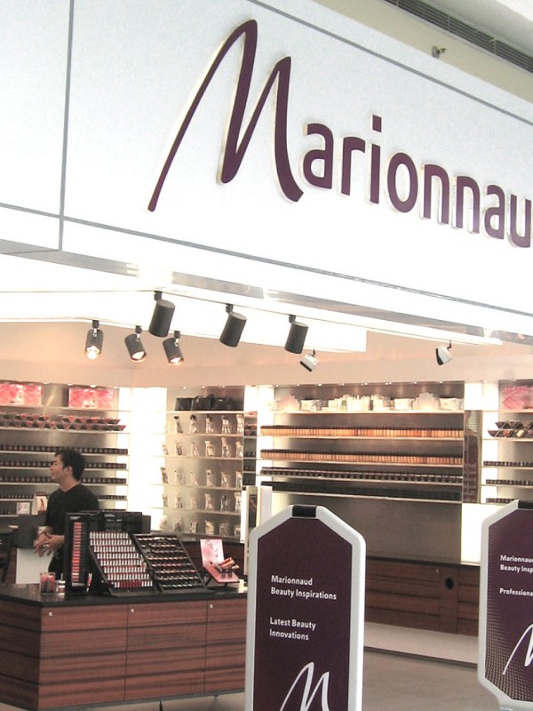
[vc_row row_type="row" use_row_as_full_screen_section="no" type="grid" text_align="left" background_image="350595" box_shadow_on_row="no" el_class="y3insidebanner"][vc_column css=".vc_custom_1463731956110{margin-top: 30px !important;}"][vc_empty_space height="100" image_repeat="no-repeat"][vc_column_text] MARIONAUD Beauty inspirations [/vc_column_text][vc_empty_space height="200" image_repeat="no-repeat"][/vc_column][/vc_row][vc_row row_type="row" use_row_as_full_screen_section="no" type="grid" text_align="left" box_shadow_on_row="no"][vc_column css=".vc_custom_1463731956110{margin-top: 30px !important;}"][vc_column_text][sb-view-breadcrumb][/vc_column_text][/vc_column][/vc_row][vc_row row_type="row" use_row_as_full_screen_section="no" type="grid" text_align="left" box_shadow_on_row="no"][vc_column][vc_empty_space image_repeat="no-repeat"][vc_column_text el_class="h1-title"] Bringing Europe's leading retail beauty brand to Asian consumers and developing a destination retail experience. [/vc_column_text][/vc_column][/vc_row][vc_row row_type="row" use_row_as_full_screen_section="no" type="grid" text_align="left" box_shadow_on_row="no"][vc_column][vc_empty_space image_repeat="no-repeat"][vc_single_image image="350597" img_size="full"][/vc_column][/vc_row][vc_row row_type="row" use_row_as_full_screen_section="no" type="grid" text_align="left" box_shadow_on_row="no"][vc_column width="1/2"][vc_empty_space image_repeat="no-repeat"][vc_column_text] The Challenge Marionnaud is one of Europe’s largest retailer of exclusive beauty and luxury brands, but repeating that success in Asia is a different ball-game. We were commissioned by A.S. Watsons to make a study of Asian women and their attitudes towards beauty, to help recommend a new approach to beauty retailing in Asia. [/vc_column_text][/vc_column][vc_column width="1/2"][/vc_column][/vc_row][vc_row row_type="row" use_row_as_full_screen_section="no" type="grid" text_align="left" box_shadow_on_row="no"][vc_column][vc_empty_space image_repeat="no-repeat"][vc_single_image image="350596" img_size="full"][/vc_column][/vc_row][vc_row row_type="row" use_row_as_full_screen_section="no" type="grid" text_align="left" box_shadow_on_row="no"][vc_column width="1/3"][vc_empty_space image_repeat="no-repeat"][vc_single_image image="350598" img_size="full"][/vc_column][vc_column width="1/3"][vc_empty_space image_repeat="no-repeat"][vc_single_image image="350599" img_size="full"][/vc_column][vc_column width="1/3"][vc_empty_space image_repeat="no-repeat"][vc_single_image image="350601" img_size="full"][/vc_column][/vc_row][vc_row row_type="row" use_row_as_full_screen_section="no" type="grid" text_align="left" box_shadow_on_row="no"][vc_column width="1/2"][vc_empty_space image_repeat="no-repeat"][vc_column_text] The Insight DIA developed a multi-market research study that covered Singapore, the Philippines and China that sought to identify the main drivers of perceptions towards female beauty, the relationship between Asian women and beauty brands and what they were looking for in a beauty retail environment. This revealed a clear focus on holistic beauty amongst Asian women.   A new brand positioning for Marionnaud in Asia was created around the concept of ‘beauty inspirations’. The idea encompasses both inner and outer beauty needs and was expressed through a new brand identity and in-store experience that made its debut in a new 10,000 sqft prototype store at the Mall of Asia in Manila.   ‘Retailtainment’ was a key aspect of the experience concept and this was brought to life through features such as the cosmetic and fragrance bar, a beauty theatre for demonstrations and a juice bar to chill out, amongst others. [/vc_column_text][vc_empty_space image_repeat="no-repeat"][vc_column_text] The Impact Marionnaud launched to great success in The...